ML & Investing Part 2: Clustering
By Kevin Zatloukal
September 2019
INTRODUCTION
In the first installment of this series, we went over the basic terminology and techniques of machine learning and saw one approach for creating models that can make non-linear predictions about data. Those models (ensembles of decision stumps) are capable of finding linear relationships, given enough data, but are not limited to them.
Moving beyond linear models is useful to us because, as we saw last time, the financial data of real companies exhibits non-linear relationships in economically important parameters. We will see more examples of that shortly.
In this article, we will look at another way to build models that can describe non-linear relationships. While very different from the ensembles of decision trees that we saw last time, these new models also generalize linear regression and should be easy to incorporate into your modeling process.
As in the first installment, we will see an application of these methods to investing. We will use them to build a value investing strategy that exhibits more complex behavior, the ability to add or remove a stock from the portfolio in response to changes in fundamentals even if the ratio of its price to book value is unchanged. Interestingly, this only slightly more complex value strategy has continued to outperform the market since 2000.
We will start, however, in the same place as we did last time, not with how to beat the market but with how to beat your friends at fantasy football.
Running Backs Drop the Ball
Last time, I discussed the problem of predicting which college wide receivers would go on to be successful in the NFL. You may have noticed that I did not discuss running backs, even though the techniques we considered would also apply to them.
The reason for this omission was the standard one: no one likes to discuss their failures. Perhaps “failures” is too strong of a word, but it is fair to say that my running back models have not matched the outperformance of the wide receiver models that we did discuss.
There was, however, an intuitive explanation for that discrepancy: while all wide receivers are drafted to do the same thing (run a great route and then catch the ball), different running backs are often asked to do different things for their teams. Some running backs are asked to catch passes, some to run between the tackles, some to run outside, some to carry the ball across a goal line stacked with nine defenders, et cetera. Furthermore, just as we do not expect the same features to be predictive of quarterback success as wide receiver success, we would not necessarily expect the same features to be predictive of success running at the goal line and success catching passes.
A quick examination of the data shows that, even in college, running backs are used differently. This following plot shows each drafted running back since 2000. The X coordinate is that player’s weight, and the Y coordinate is his share of the team’s completed passes over his career.
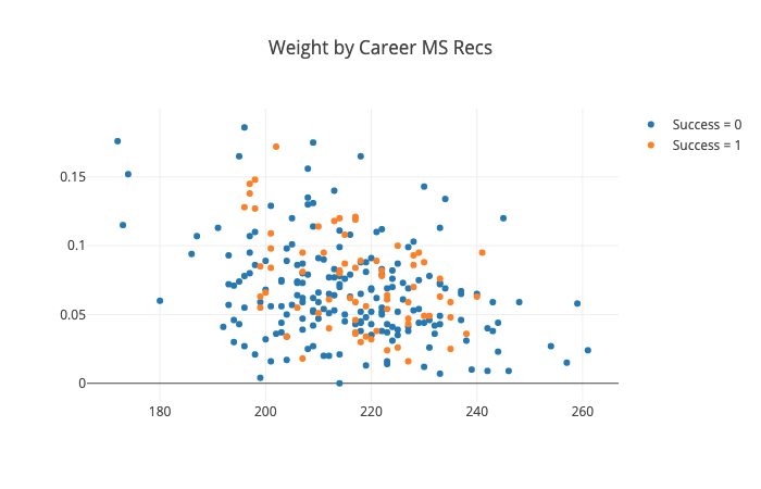
We can see that lighter weight running backs are much more likely to catch passes. However, not every light-weight back does catch passes.
More importantly, we can see that the running backs that were successful in the NFL (the orange dots) come from every part of this picture. Many heavy-weight running backs were successful. Lighter weight backs, both those that caught many passes and those that did not, were successful as well.
This picture also shows why trying to find a single formula to predict success of all running backs will be problematic. Weight, for example, is unlikely to be predictive because both light and heavy running backs have success. However, it may be the case that, for running backs that will be asked to run near the goal line, weight is important, while for running backs that are asked to catch passes, being light is important. These nuances may not be picked up by a single model trying to fit the data for all running backs. As a result, we may have more success trying to build different models for different groups of running backs, even though each model will have less data to learn from.
Of course, the only way to find to find out for sure is to do the experiment: build the model on the training data and then evaluate it on the test data.
The first step in building such a model will be to put the running backs from the training data into groups of similar examples, a process called “clustering”. We can avoid the work of doing this by hand and save ourselves from introducing any biases by using a machine learning algorithm to do so.
Clustering is an example of a machine learning algorithm that does not require labels on the data points. Such algorithms are called unsupervised learning algorithms, in contrast to the supervised learning algorithms we saw last time. Ultimately, we will apply a supervised learning algorithm to each of the clusters. Combining the two approaches in this way is called semi-supervised learning and is extremely common in practice.
As with supervised learning, there are many approaches to unsupervised learning. However, in this case, there is, in my view, a natural one to try first: the most well-known and generally useful algorithm called “K-Means”. This method is closely related1 to principal component analysis, a frequently used tool from traditional statistics.
Clustering with K-Means
The “K” in the name stands for the number of clusters that we want to find. This is a number that we must choose beforehand. The “Means” in the name comes from the fact that each cluster is represented by the mean (centroid) of all the data points in that cluster. Each point will be placed into the cluster whose mean is closest to itself.
The K-Means algorithm maintains a current set of K points that represent the centers of the K clusters. To start the algorithm, we need an initial choice for the K centers. One option is to simply pick K of the data points at random to be the initial cluster centers. Once we have done that, the algorithm proceeds with these two steps:
- Assign each point to the cluster whose center is closest.
- Update each center, replacing it with the mean of the points in that cluster.
Repeat those two steps until the centers stop moving in the update step. This usually happens fairly quickly. That’s the entire algorithm.
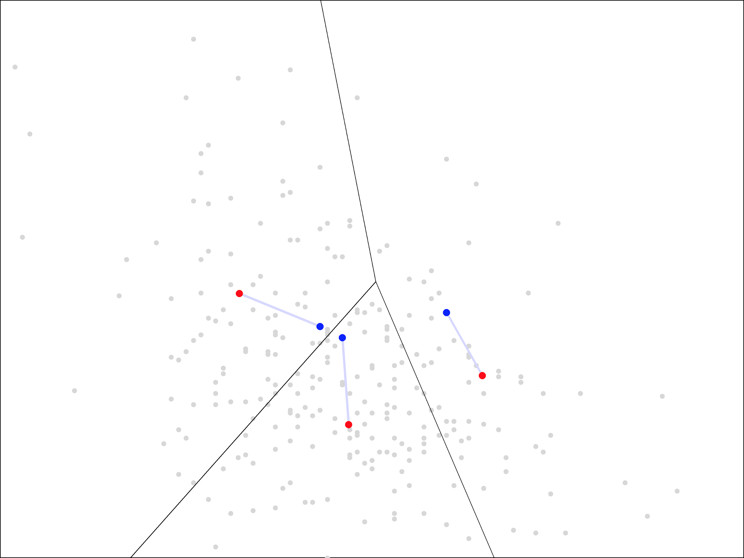
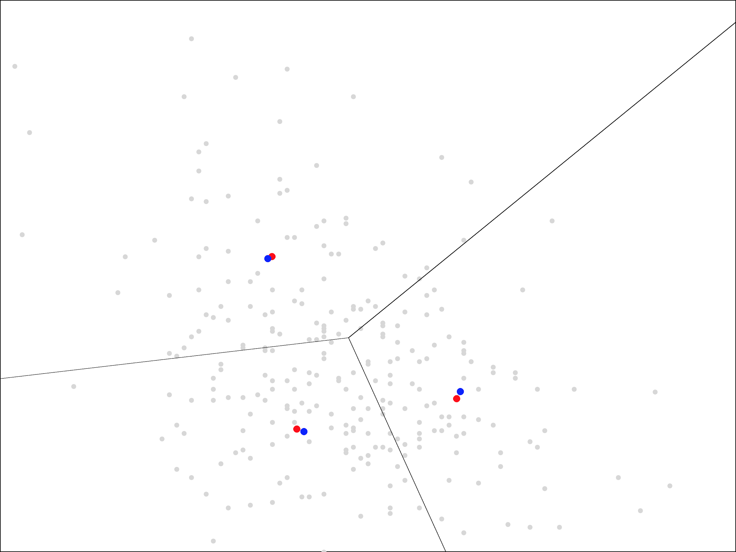
To see the algorithm in action, let’s go back to our running backs, each represented by an (X, Y) point corresponding to his weight and career market share of team receptions.
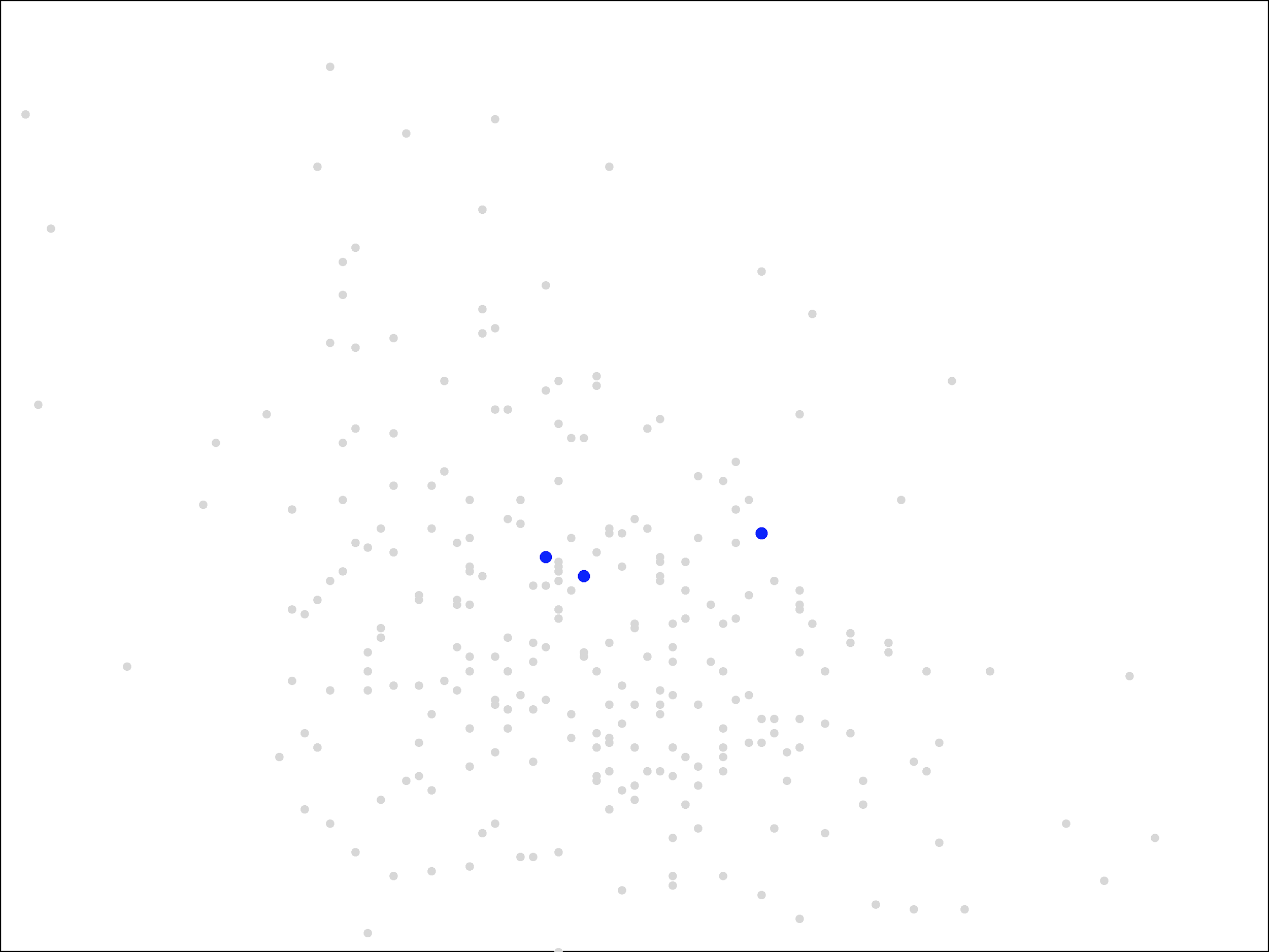
We will look for a clustering into three groups. The three initial centers were chosen at random from the set of points and are shown in blue.
The next step in the algorithm is to assign each point to the nearest cluster. The easiest way to visualize this is by drawing lines to separate the plane into the regions that are closest to each of the blue points.
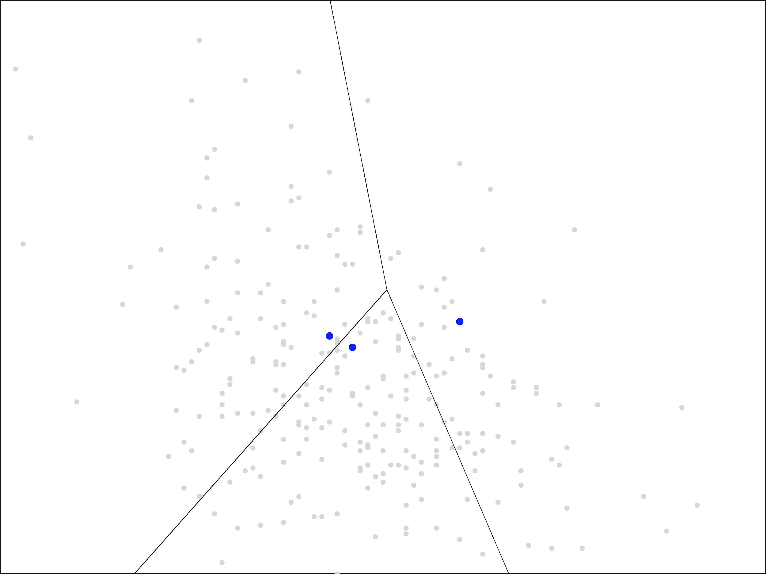
The result is called a Voronoi diagram. As you can see, each region contains a single blue point. The grey points within each region are the ones closest to that blue point.
Voronoi diagrams are not too difficult to draw by hand. Each of the line segments shown is drawn where the points are equal distance between the two blue points. You can plot this yourself by drawing a line segment between the two blue points, finding the midpoint of that segment, and then drawing a perpendicular line through that midpoint. These “perpendicular bisectors” make up the line segments in the picture above. Each bisector is included up until it hits another bisector (at a point equidistant between three blue points).
The Voronoi diagram gives a visual representation of the “assign” step of the algorithm. Next, we update the cluster centers, by averaging all the points within each region. This moves the centers from the blue points to new locations, shown here in red:
The new cluster centers are visually closer to the middle of these regions than the original ones, which were simply randomly chosen points from the data set.
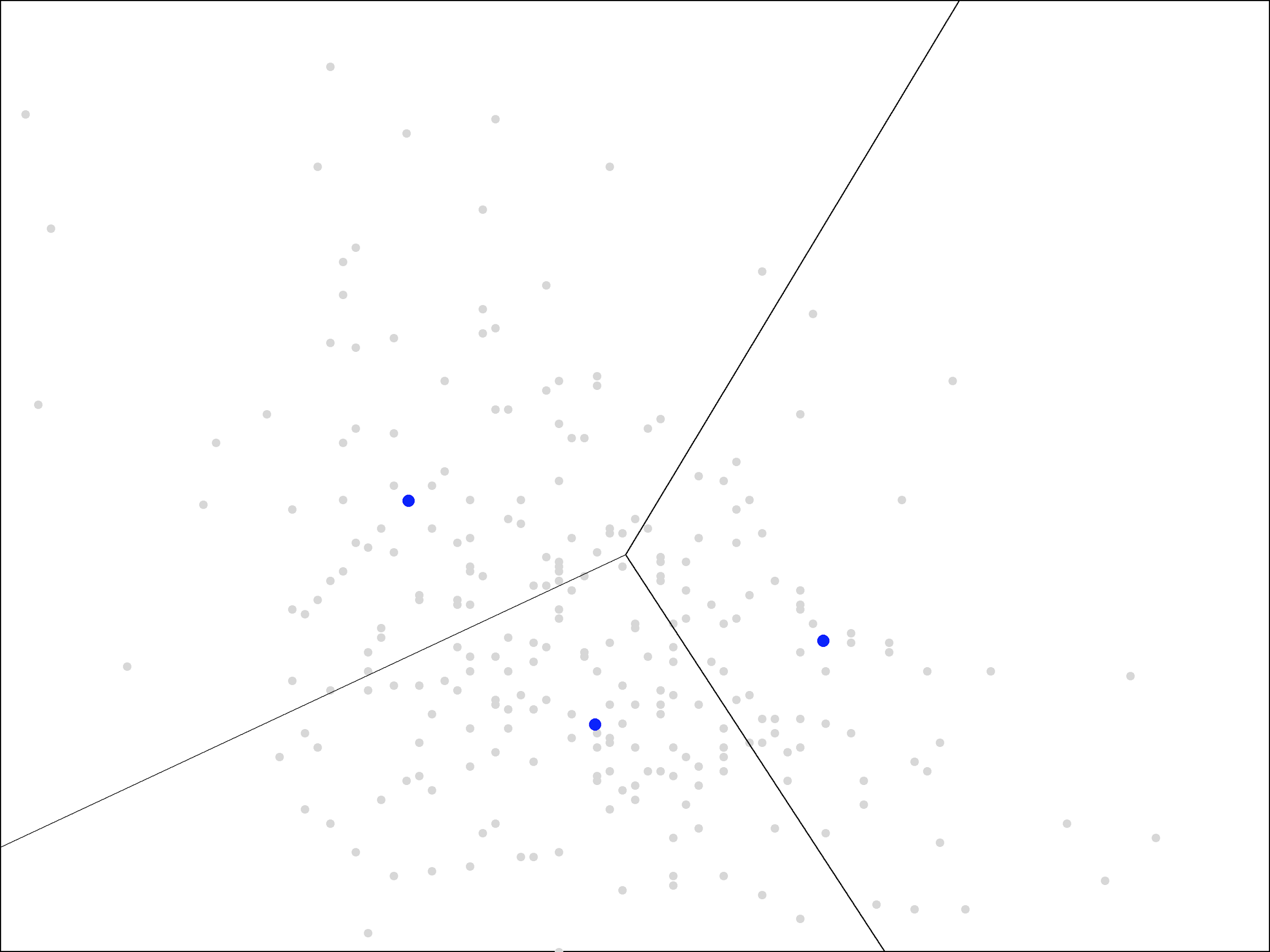
We continue by repeating the steps again. First, we assign each point to the closest cluster center, which we can visualize with a new Voronoi diagram, using the updated blue points:
Then, we update the centers again by averaging the points within each region, moving the blue points to the new locations shown in red:
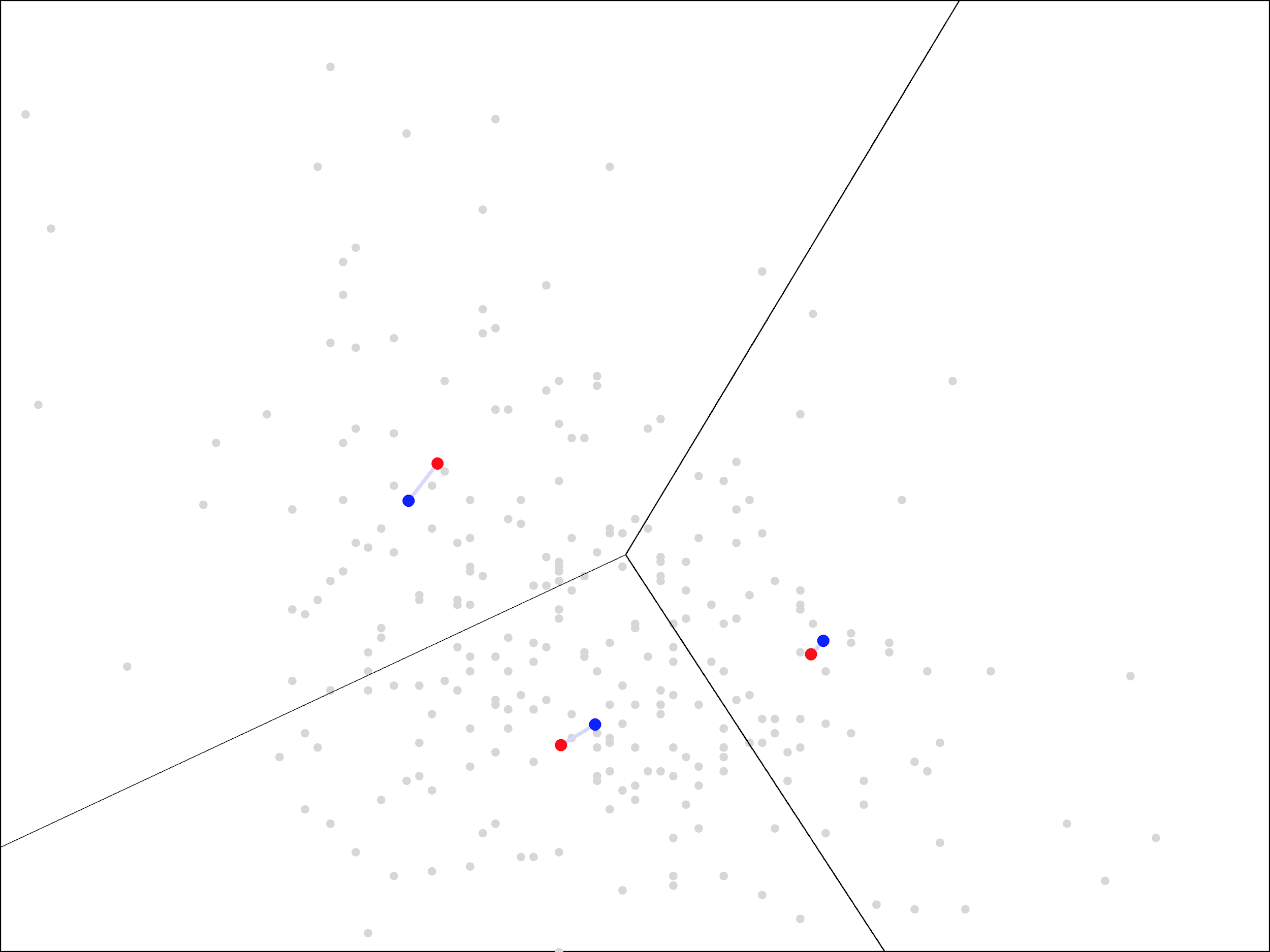
As you can see, the update step has a much smaller effect the second time, with the centers only moving a small distance. The same trend continues as we repeat the assign and update steps more times.

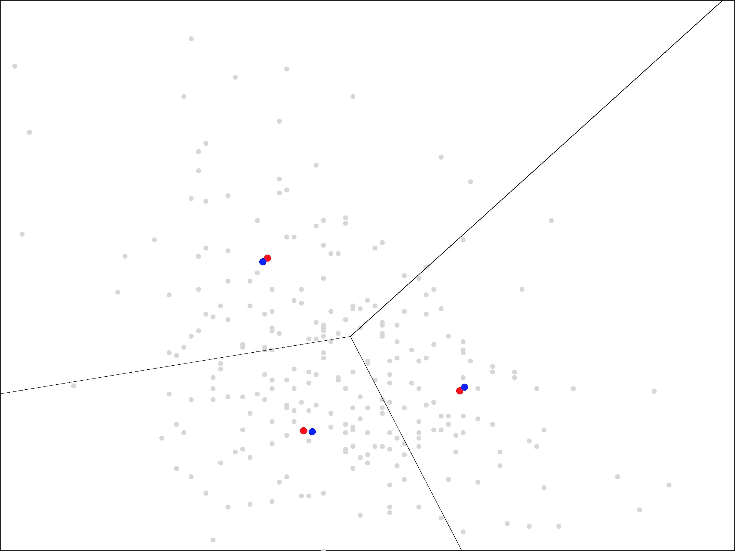
On each iteration, the centers move less and less. Ultimately, it takes about 15 iterations before the centers stop moving all together. At that point, we end up with the following centers and regions closest to each center:
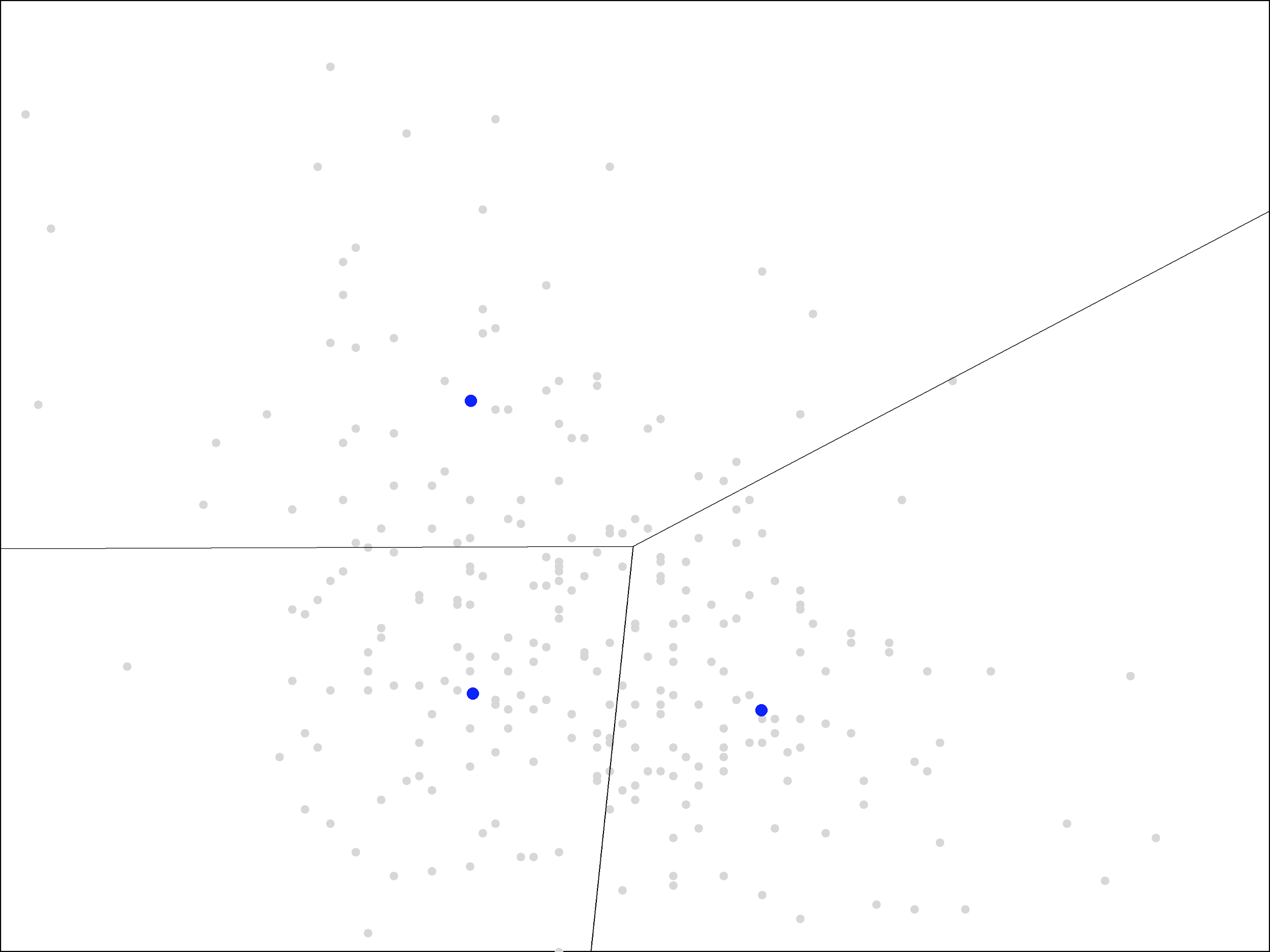
With each of the later iterations, the centers rotated a bit more in a clockwise direction. They eventually settled in the arrangement shown above, nearly forming a right triangle.
The two centers on the left have almost the same X coordinate, representing a weight of around 205 pounds, while the center on the right represents a weight of around 230 pounds. The two centers on the bottom have almost the same Y coordinate, representing a 5-6% market share of the team’s receptions, while the center on the top has a much larger market share of 12.5%.
It is important to note that, in the picture, a difference of 25 pounds is drawn as about the same distance as a difference of 7% (or 0.07) in market share. If we instead used the same scale for both axes, the points would appear in a horizontal line since their differences in market share (Y) are so small.
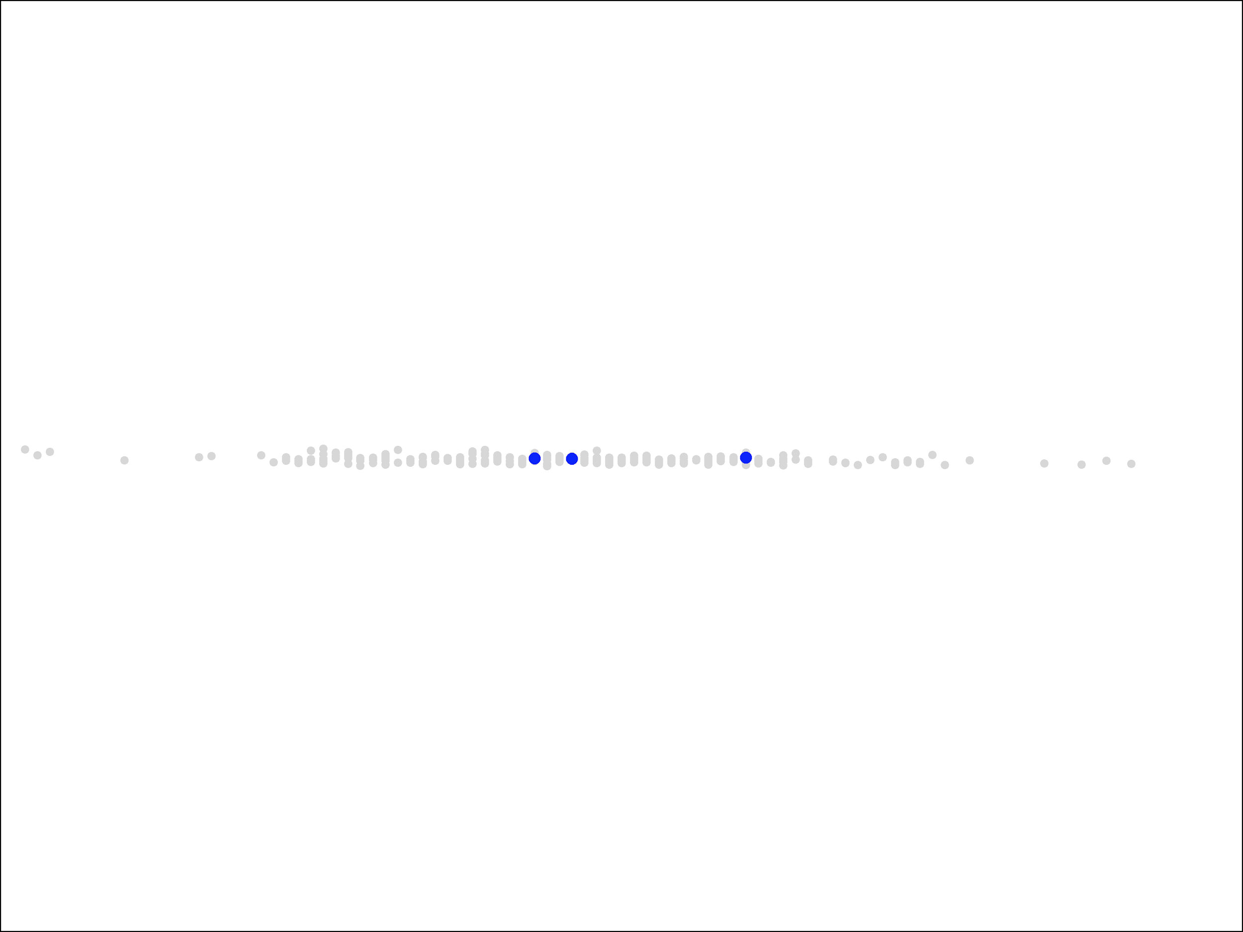
It is critical to note that the scales of each dimension affect the results of the algorithm, not just our visualization of it. If the points are presented to the algorithm as in the picture above, then the algorithm will see that all of the variation is solely in the X dimension and it will end up splitting them solely in the X dimension like this:
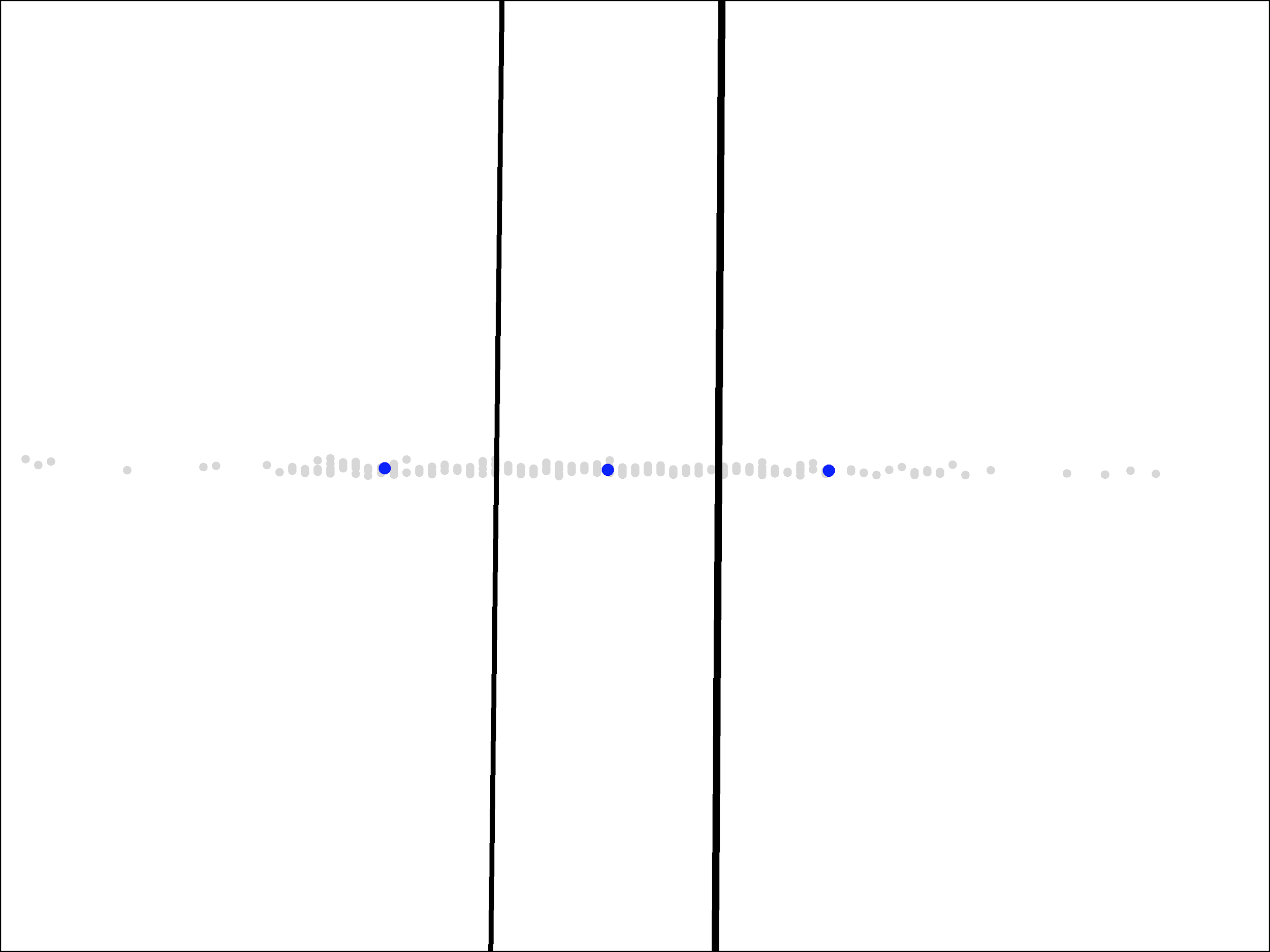
This result is not a squashed version of the regions we saw above. We get completely different centers and completely different regions.
The algorithm is doing the right thing based on the data that we gave it. This new picture is the best way to split those points into three groups. Rather, we made the mistake by presenting the data points the way that we did. If we believe that both dimensions, weight and market share of receptions, are equally important, then we should give the algorithm points that show that visually: by having an equally large spread of values in both directions.2 (On the other hand, if we do not believe that the two dimensions are equally important, then we can reflect that view by using a smaller scale for one than the other.)
An Improved Running Back Model
With proper scaling, viewing the two dimensions as equally important, we ended up with the following clusters:
One advantage of clustering with a small number of clusters is that it is often easy to understand and characterize the individual groups. That is certainly true in this case.
- The region on the right, whose center represents a weight of 230 pounds, distinguishes itself from the other two by containing the running backs with large weights (above 217 pounds or so). These heavy running backs are more likely to be asked to run at the goal line, an especially valuable role since touchdowns bring extra fantasy points.
- The region on the top, whose center represents a market share of 12.5% of the team’s receptions, distinguishes itself by containing the running backs who catch a larger share of passes (above 9% or so). These could be called third down backs, as they have a better chance of being used in likely passing situations like third down and long. Catching passes also results in extra fantasy points, at least in point-per-reception leagues.
- The region in the bottom-left, contains running backs that did not catch a large share of passes in college and are also not heavy. We could call these light running backs, noting that light-weight running backs who caught many passes are instead third down backs.
Of course, our goal in this process is not just to understand the running back data but rather to make more accurate predictions of their odds of success in the NFL. With the clusters in hand, we can now return to that problem.
Our intuition was that the NFL measures running backs in different clusters differently, and, as a result, the best features for predicting success would be different for different clusters. To find out whether that is the case, we can return to supervised learning: build a separate logistic regression model for each cluster and see whether the models weigh the features differently or not.
As we should expect, all the models do put the most weight on how high the player was taken in the NFL draft. That is the most useful information we have regardless of cluster. However, beyond draft pick, the models do indeed emphasize different measures:
- For heavy running backs, the model emphasizes rushing yards in their final college season, wanting to see more than 1100 yards, as well as their market share of the team’s rushing yards, wanting it to be in excess of 24%. Interestingly, while this cluster in general does not catch many passes, the model wants to see receiving touchdowns, which are a real possibility for running backs used near the goal line, even if those running backs do not catch a large share of passes in general.
- For third down backs, the model emphasizes the running back’s ability to accelerate quickly, as measured by their 20-yard short shuttle time at the NFL combine. It also looks at their speed, but due to the fact that many third down running backs are taller than usual, it prefers to use a height-adjusted speed score rather than, say, their time in the 40-yard dash.
- For light running backs, the model emphasizes at raw speed, as measured by their time in the 40-yard dash, and also at the ability to change direction, as measured by the 3-cone drill at the NFL combine.
Each of these models makes sense in isolation. For example, it makes sense that the model would emphasize the ability to accelerate quickly when looking at third down backs since they often catch the ball at a low speed and then need to take off as fast as possible, whereas for light running backs who do not catch passes, it would care more about the ability to change direction quickly, which they will need when running both outside of the tackles and between them. It also makes sense that the latter two models do not include anything about receiving ability since the cluster itself already gives us that information.
Of course, while having a model that makes sense is comforting, the final measure of a model is whether it improves prediction accuracy. In that area, this new model also shines. It drops the error rate from over 20% down to around 15%, a huge improvement for data as noisy as this.
Note that, as always, this is the out-of-sample error rate. As we discussed in the first installment, we prevent overfitting by using the separate data to fit the model and to test the model. The error rate on the data used to fit the model is not meaningful.
Finally, I can note with some pleasure that the new model gives a much better prediction for Alvin Kamara, who, in 2017, was originally given only a 43% chance of success and now improves to almost 70%. While it makes sense to look at the overall error rate and not individual examples, it is especially embarrassing to whiff on the NFL’s offensive rookie of the year, so it is pleasing that the new model fixes that mistake.
An Improved Value Model
We can use the same idea that improved our running backs model — the idea of building separate models for different clusters of examples — in order to improve some models useful for investing, namely, models for predicting the intrinsic value of a company based on fundamentals.
For this, we will represent individual companies in two dimensions, this time, using their return on equity (ROE) and profitability. Companies with high ROEs are, in principle3, more valuable than those with low ROEs. Meanwhile, Robert Novy-Marx demonstrated that companies with high profitability, as measured by the ratio of gross profits to assets, are, in practice4, more valuable. Hence, we have reason to believe that two companies that are widely different in either of these measures are likely to have different intrinsic values even if, say, their book values are the same.
One problem we run into in this case that did not appear above is the effect that economic cycles have on these metrics. In a recession, for example, all companies earnings, and hence ROEs, are going to drop. We do not want to respond by dropping all of our estimates of intrinsic value due to a downturn in the broader economy that is likely to be temporary.
One option for working around this would be to average the returns over longer periods of time. However, another option, which we will use instead, is to compare companies not by their nominal ROEs and profitability but by their ranking compared to other companies at the same time. If all companies earnings drop during a recession, those with high ROEs can still stay ahead of other companies in these rankings even as their ROE drops as well.
Using ROE rank as the X dimension and profitability rank as the Y dimension. We end up with the following plot, representing large cap US companies in November of 2017, excluding financial firms and real estate (whose profitability can look different):

We can see that the data points tend to cluster along an imaginary Y=X line, going from the bottom-left to the top-right corner. This happens because ROE rank and profitability rank are correlated, about 50% correlated, in fact. Perfectly correlated data would lie exactly along this line, and with even a 50% correlation, we can still visually see a tendency to be somewhat close to this line.
We will apply the K-means with 4 clusters. Before seeing the correlation in the data, we might have expected that equal size clusters would give us regions corresponding to the four quadrants, but, due to the correlation, we instead get a different pattern of regions:
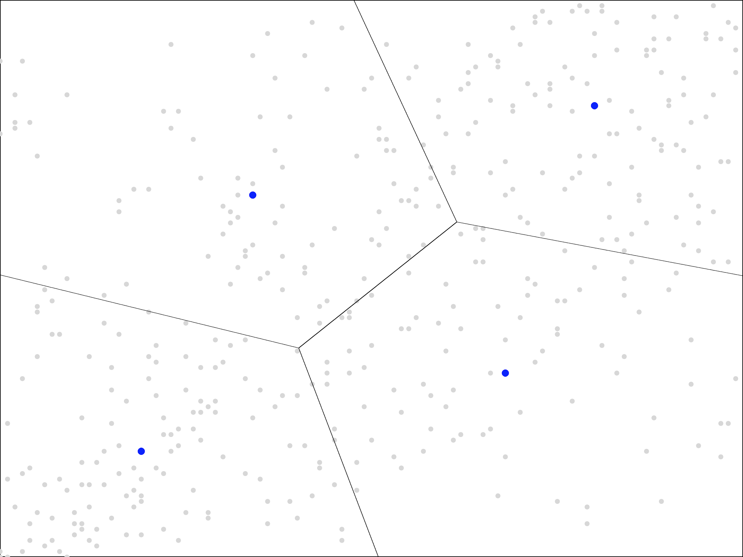
Our clusters do not even end up with equal size, like quadrants would be. Instead, the top-left and bottom-right regions are larger in size than the bottom-left and top-right.
As with our running back example, the clusters are showing us useful information about the shape of our data. With running backs, the fact that our three clusters ended up in a right-triangle shape demonstrates that the top right corner of the picture (heavy, pass-catching running backs) was sparsely populated. With companies, the fact that the bottom-left and top-right clusters are smaller demonstrates not only the correlation between ROE and profitability but also the tendency for companies to score well or poorly in both. It is the middle region, with mediocre scores in both areas, that is sparsely populated.
Were that not the case, the top-left and bottom-right regions would not be so interesting. Separating companies with a rank of 51 in ROE and 49 in profitability from the reverse is splitting hairs. But since that region is sparsely populated, the top-left and bottom-right regions largely contain companies that do quite well in one metric but not in the other, and that potentially contains useful information about their future prospects.
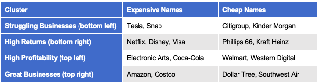
As with our running back example, our clusters are also easy to understand and describe. Here are some example names within each cluster as of late 2018:
Clusters in hand, we can move on to building a model that estimates intrinsic value. For this experiment, we will consider the simplest possible approach: we’ll use linear regression with market cap as the output and book value as the only input (not even a constant term). The best linear model, in this case, is essentially the average P/B value in the cluster.5 We will call this the estimated P/B of the cluster.
Applying this to each of the clusters of US large cap stocks gives the following results:
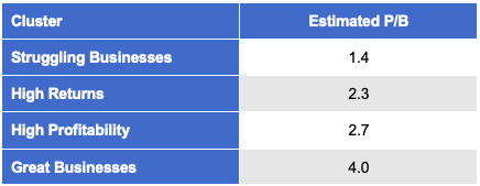
We can see that the market does consider great businesses to be substantially more valuable than struggling ones. It makes sense that Warren Buffett would be willing to accept merely a “fair” price for such companies rather than a great price, as we would demand for a struggling business.
Note that the other two clusters, high returns and high profitability, also receive a more premium price from the market, though not nearly to the same extent as great businesses. Also note that, of the two, highly profitable firms are valued slightly more than firms with just high returns on equity.
We can use these models to build a portfolio as follows. Each month, we sort all the companies in our universe by price divided by the model’s estimate of intrinsic value, which is just the company’s book value times the estimated P/B for its cluster. Then we purchase the cheapest quintile, with around 100 stocks in the US large cap universe.
To make sure that we understand what the model is doing, note that sorting by price divided by 1.4 times book value would give exactly the same order as sorting directly by P/B. The former is simply the latter divided by 1.4, so the order is unchanged. Hence, for companies in the same cluster, this is just the standard value portfolio.
These models only enter the picture when we compare companies in different clusters. If one is a great business and the other a struggling one, then we are comparing P/B divided by 4.0 to P/B divided by 1.4. As a result, we would consider the great business to be cheaper if it’s P/B is up to 3 times as large as that of the struggling company.
This new portfolio has potentially more complex behavior than a standard value portfolio. In particular, it is now possible for a stock to enter or exit the portfolio based on a change in its ROE or profitability even if it’s rank by P/B is unchanged. For example, it might be in the cheapest quintile when we estimate its intrinsic value at 4.0 times book value, but if it should drop out of that cluster into the high ROE, low profitability cluster, then we estimate its intrinsic value at only 2.3 times intrinsic value. Thus, it’s new price to intrinsic value ratio could be outside of the cheapest quintile even if it’s price and book value are completely unchanged.
The overall returns for this portfolio, which we will call “Clustered Value”, are shown in the following table along with corresponding results for the market and ordinary (vanilla) value:
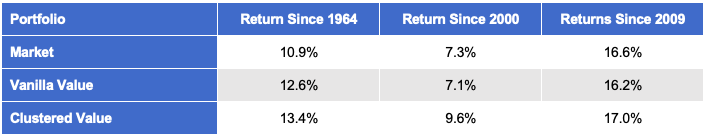
Note that both value portfolios are reformed every month. Historically, value portfolios do better with longer holding periods. However, that is not true for the clustered value portfolio. It’s results get worse (slightly) even with 2- or 3-month holding periods.
While value investors are familiar with finding bargains amongst the struggling business (“deep value”) and with buying great businesses at somewhat higher prices (following Buffett & Munger), the idea of paying more for companies that only have high profitability but not high returns, or vice versa, may seem odd. However, for the clustered value portfolio, the highest returns have actually come from these two new clusters, not the familiar ones.
To understand the portfolio further, let’s look at some specific names.
Kinder Morgan
The following picture shows the ROE and profitability ranks of Kinder Morgan in each month since 2004. Each time that subsequent points changed clusters we draw a line between the two points representing those months, and the middle of that line is labelled by the year and month in which that occurred.
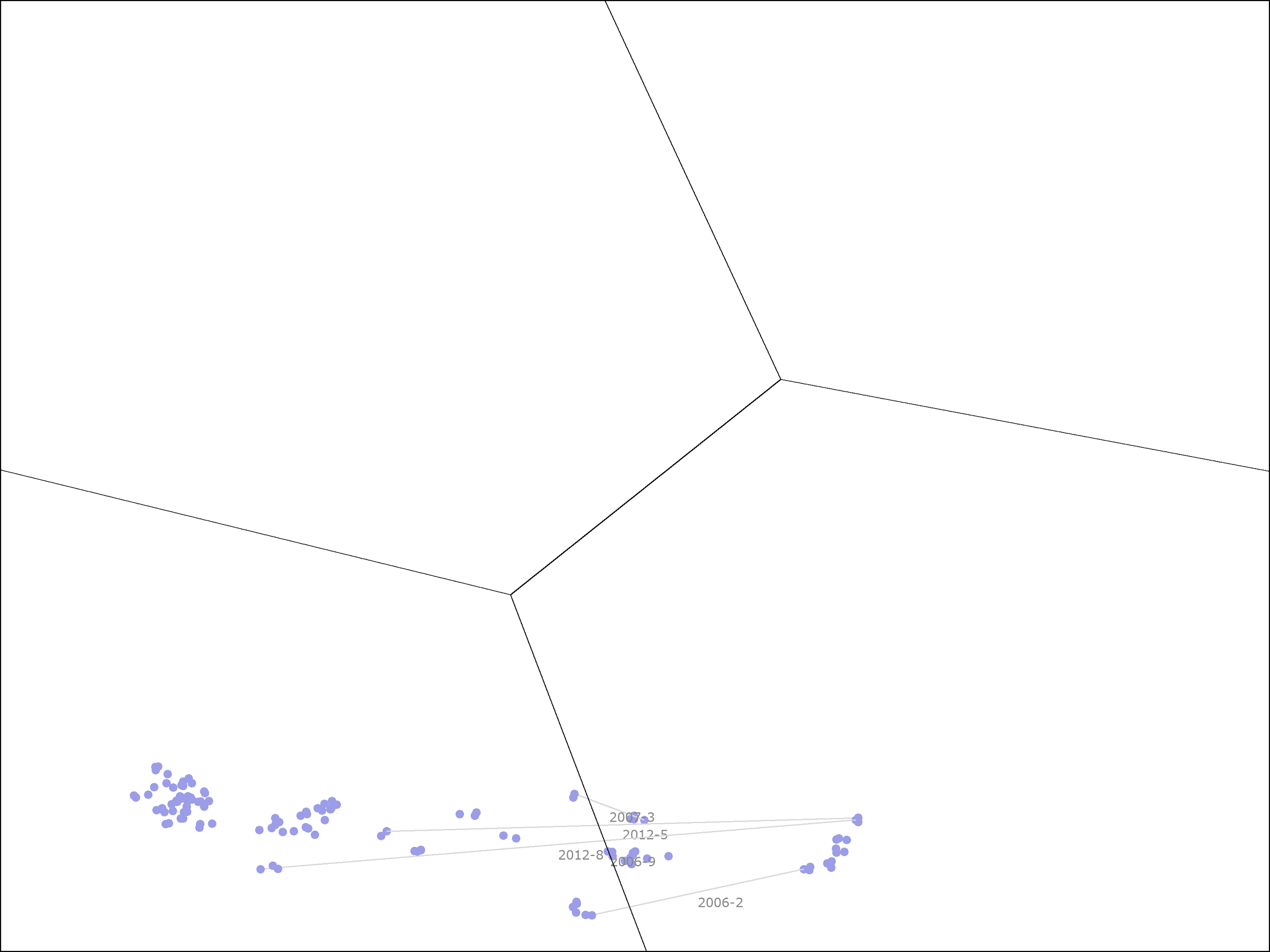
Kinder Morgan started out in the high ROE, low profitability cluster. In May of 2004, it was in the cheapest quintile, so it was held by the clustered value portfolio. Over the subsequent 7 months, it returned 44.8% at an annualized rate, but at the end, it had become expensive enough to move out of the cheapest quintile, so it was sold by the portfolio.
In February of 2006, Kinder Morgan’s ROE dropped precipitously, causing it to fall out of the high ROE cluster into the struggling business cluster. This is shown by the bottom-most horizontal line in the picture, labelled “2006-2”. It’s ROE improved in late 2006, moving it back into the high ROE cluster, but then dropped again in early 2007, moving it back to the struggling business cluster. This second drop is shown by the top-most horizontal line in the picture, labelled “2007-03”.
Shortly after that event, Kinder Morgan was taken private. It re-emerged as a public company in mid-2011. From this point to the current day, it stayed almost entirely in the struggling business cluster. However, it’s price was now cheap enough that it re-entered the portfolio. This occurred despite the fact that it the model now estimates it’s intrinsic value at only 1.4 times book value, rather than the 2.3 times book value estimate that was used earlier.
From mid-2011 to late 2018, Kinder Morgan was in the portfolio for 40 of the 88 months. During that time, it returned 24.0% on an annualized basis. Note that, while any of us would be happy with 24.0% annual returns, this is substantially lower than the 44.8% returns that it saw during the earlier time period when it was in the high ROE cluster, a time period when the stock was over 4 times more expensive on a simple P/B basis! The portfolio was rewarded, in this case, for being willing to buy a more expensive stock.
Southwest Airlines
The following picture shows the same information for Southwest Airlines from late 1982 to late 2018:
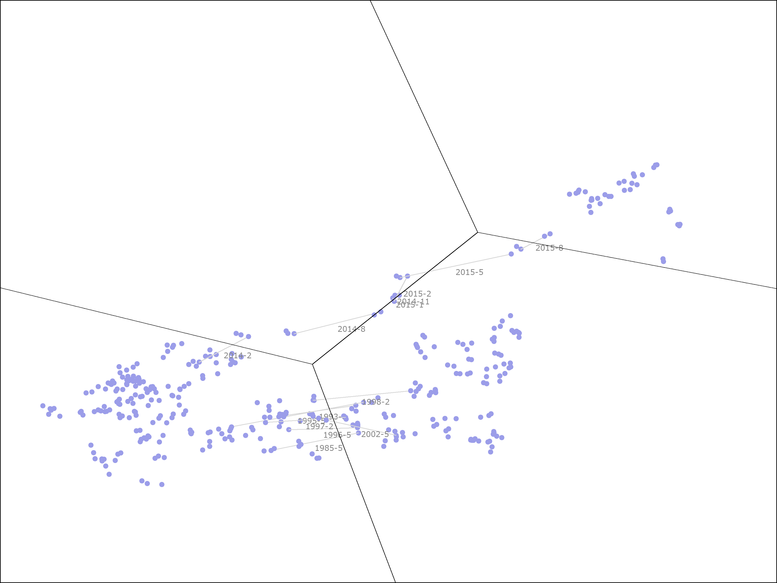
While there is a lot going on in this picture, we can separate Southwest’s history into two distinct periods.
From 1982 through 2013, the ROE and profitability ranks put it either in the struggling business or high ROE, low profitability clusters, along the bottom. During that time, it was in the portfolio once from late 2008 to mid-2009 and a second time from late 2011 to late 2012, both times when it was in the struggling business cluster. For the first period, starting in 2008, the portfolio held Southwest for 8 months, during which time it lost 13.3% on an annualized basis. For the second period, starting in 2011, the portfolio held Southwest for 13 months, during which time it gained 14.6% on an annualized basis. Combined, this is a 3% annualized return.
In 2014, Southwest’s profitability started to improve. By 2015, it was in the top half of the large cap US stocks by this measure. It has maintained higher than average profitability since then, leaving it in either the great business or high profitability, low ROE clusters throughout this time period. The portfolio held the stock for 6 months, during which time, it returned 39.6%, or 94.8% on an annualized basis. (Overall, from the time that Southwest moved into the high profitability, low ROE cluster in 2014, it has returned 19.3% annualized, even though it has mainly been in the second cheapest quintile rather than the cheapest quintile.)
As with Kinder Morgan, Southwest gave us the highest returns when it was more expensive on a plain P/B basis. During the first period, when Southwest returned only 3% annualized, it was trading at a significant (30+%) discount to its book value, whereas, during the second period, when it returned 95% on an annualized basis, it was trading at over twice its book value. This highlights the benefits of moving from a basic linear regression model to one that takes advantage of clustering.
Further Improvements
The clustered value portfolio could be improved in many ways. One simple improvement would be to add a quality filter.
An analysis of the returns suggests that investing in the worst companies in terms of ROE and profitability is rarely profitable, even at a price close to book value. Dropping all stocks with a ROE rank plus profitability rank less than 25 improves the returns by 0.4% per year since 1964 and by 1.7% per year since 2000, a sizeable improvement.
The best approach for building a quality filter, however, would likely be to use machine learning yet again. In particular, the ensembles of decision stumps that we designed last time are well-suited to this approach! Combining clustering, linear regression, and ensembles of decision trees in this manner would likely give us very nice results, but I will leave that as an exercise to the reader.
The other area that jumps out for potential improvement concerns the number of clusters. Given the benefits we have seen in moving from one model for all companies (one cluster) to separate models for each of the four clusters, it is natural to wonder whether we would get more benefit from moving to a model with even more clusters. As we will see in the next section, this is indeed the case.
Hyper-Parameter Tuning
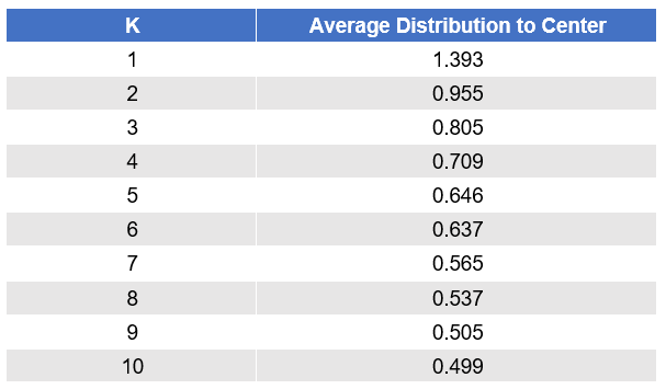
The following picture shows the returns for the clustered value portfolio as we change the number of clusters. The blue dots are the actual results (averaged over 100 trials), while the orange line shows the general trend.
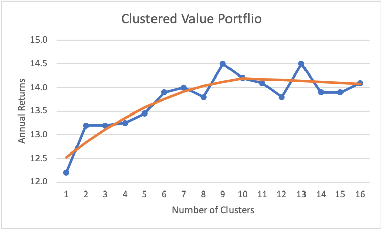
As we can see, returns continue to improve as we add more clusters, up to around 10 or so, at which point, it tapers off.6
If we were to deploy this strategy with real money, we would want to use 9 or more clusters. My preference would probably be to use 9 clusters as it’s easier to come up with 9 catchy names for the clusters than 12 or more.
We can also see that the results are noticeably higher with 9 (and 13) clusters. It is possible that those are real effects. However, it is probably safer to assume that this is simply noise and use the trend line as our estimate. In either case, the data tells us that results should be higher with around 10 clusters.
The problem of choosing the number of clusters is an example of “hyper-parameter tuning”. The number of clusters is not a parameter that is chosen for us by the model fitting algorithm (K-means). Instead, it is a number chosen by us, making it a “hyper-parameter” rather than an ordinary parameter of the model.
How do we choose a value for the hyper-parameter? An easy option is simply to do what we did above: try all the values, plot the results for each, and have a look at them.
In many cases, we will see results, like we did above, that continue to improve as we increase the parameter value, or the opposite, where results continue to get worse as we increase the parameter value. In those cases, the curves are (nearly) monotonically increasing or decreasing.
Another common pattern is for results to increase up until some point and then start to decrease, a so-called “unimodal” curve. Our running back model has that pattern. We saw how adding three clusters improves prediction accuracy, but adding more can also reduce accuracy because we now have less data to use for fitting the model of each cluster. At some point, the latter effect becomes larger than the former, and results start to get worse rather than better.
In all of those cases, the pattern of returns shows us something real and important. If the results were simply random noise, the odds that we would see 10 numbers in increasing (or decreasing) order are less than one in 10 million. The odds of seeing a unimodal curve with 10 data points still less than one in a million. So, it is extremely likely that there are real effects causing us to see curves with these shapes.
In all of those cases, choosing a value for the hyper-parameter is also quite easy. If it the results increase monotonically, pick a large value. If the results decrease monotonically, then pick a small value. If the results are unimodal, then pick a point near the peak. We may not be able to hit the exact maximum if there is some randomness in the data we are seeing, but we can be fairly confident of getting close to it.
The hard cases, for me, occur when there is no clear pattern in the data showing the results for different values of the hyper-parameter. What do we do in those cases?
One popular approach is to repeat the same idea that we use for fitting ordinary parameters. Namely, we set aside another part of the data, called the “validation data set”, fit one model for each hyper-parameter value using the training and testing data sets, and then compare the results of the different models using the validation data set.
This is a reasonable approach. However, it is not one that I usually feel comfortable with. In my experience, results that are monotonic or unimodal are quite common, and, while the approach of using a validation data set would choose a good hyper-parameter value in those cases, I sleep better having seen the curve myself and knowing that there is a real effect that causes the hyper-parameter value I chose to deliver better results.
In the cases where the curve does not have any of these shapes, I still tend to eschew the validation data set. If the curve looks mostly random, that will cause me to reconsider whether the model I am using makes sense at all and to explore other approaches. If I believe in my model but don’t see any clear reason to prefer one hyper-parameter value to another, then I would likely pick a value based on convenience (or maybe just a nice round number) rather than the one that happens to do best on the validation data set, when the evidence suggests that the latter is just random noise. I may be an outlier in this respect, but that is what has worked for me.
While hyper-parameter tuning may seem like an esoteric topic, it arises in almost every real machine learning problem. Hyper-parameters can subtly sneak into a model. Indeed, looking back at our clustered value portfolio, there is secretly another hyper-parameter hiding in the model… That hyper-parameter was the choice of which features to use for our clustering.
Above, I gave some justification for why we might want to use ROE and profitability ranks as those features, but now that we have discussed hyper-parameter tuning, the reader may be able to guess how I came upon that particular choice of features. If you guessed that I tried every combination I could think of, then you are learning well.
Given that I tried many combinations, should you be worried about overfitting? Absolutely. Does that mean we should ignore the results above? Definitely not.
If I told you that I tried, say, 50 combinations of features, built a model for each one, and then picked the combination that performed the best on a validation data set, it would not be smart to bet that this model was really the best. On the next data we see, it could easily underperform the other models.
However, this is another example that demonstrates the benefit of directly examining the results for different hyper-parameter values rather than only using a validation data set. In this case, a direct examination shows that the standard deviation of excess returns across the different combinations is less than 0.3% per year. Hence, an excess return of 1.9% per year for the combination of ROE and profitability is over six standard deviations away from the mean. The odds of seeing an excess return that large by random chance is about one in a billion, so even if we had to search through 50 combinations, we can feel confident that the result we discovered above is meaningful.
Tools
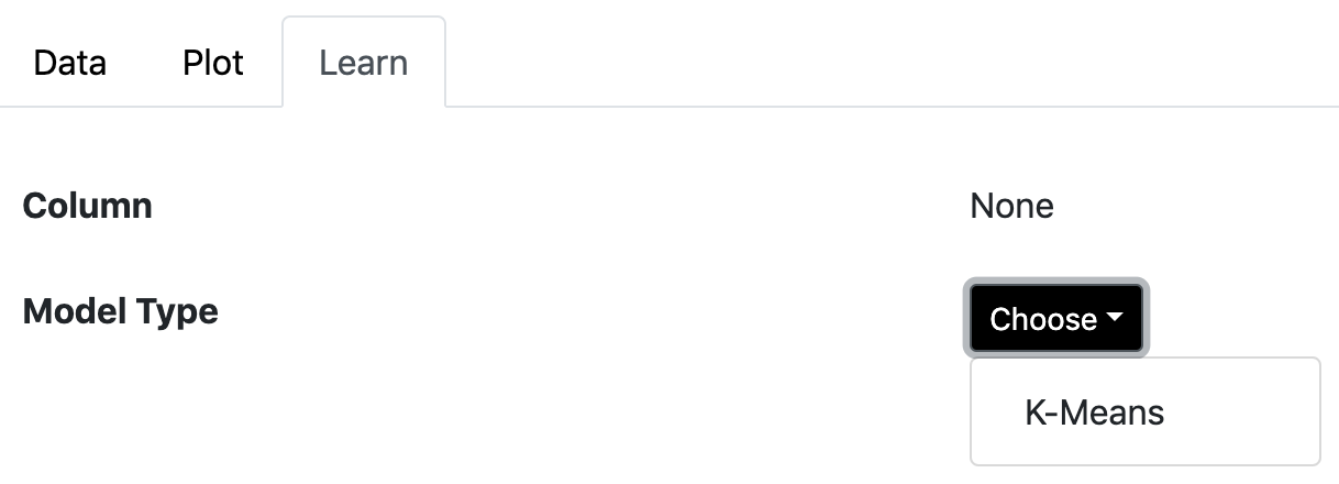
The OSAM machine learning web app includes support for running the K-means algorithm in the browser. To use it, open a table, such as the “RB Types” table included in the app, and click on the “Learn” tab at the top. Then, next to “Column”, select “None” (since we are doing unsupervised learning, there is no column we are trying to learn). Finally, next to “Model Type”, select “K-Means”.
After running the algorithm, you’ll see a page showing the model produced. Actually, you will see a number of models with different choices for the number of clusters (K). At the top, it will show you a measure of the fit with each choice of K.
As expected, the average distance of points within a cluster to the cluster center shrinks as more centers are added. There is a big drop-off with two clusters, a smaller drop-off with three clusters, and then it continues to shrink from there.
Below that, you can select the number of clusters to view and then see the particular clusters found by the algorithm. For example, with K = 3, we retrieve the same clusters that we saw above:
(The app also shows you the scaling that was applied to each column before measuring distance. This implementation scales all columns to have a standard deviation of 1.)
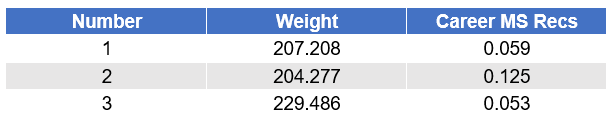
You can also apply the model to other data files. If you open a table that has columns called “Weight” and “Career MS Recs”, such as the “Drafted RBs (2018)” table included in the app, you will see a “Predict” column that allows you to apply the model to that table. Simply select the model that was built in the dropdown. The app will then add a new column to the data, called “Cluster”, that tells you the cluster to which each row would be assigned.
CONCLUSION
In this article, we looked at a second method by which we can move beyond linear regression into the more general world of machine learning. In the first installment, we looked at ensembles of decision stumps, which can describe non-linear relationships along each of the individual feature dimensions. In this installment, we looked at clustering — an example of unsupervised learning — and saw how we can piece together linear models within each region to build a model that is non-linear over the larger feature space.
Our first installment also introduced the basic terminology of machine learning and discussed the basic technique for avoiding overfitting: evaluating our model on a separate data set (the test set) from the one we used to build the model (the training set). In this installment, we discussed hyper-parameters — parameters that are not chosen for us by the model fitting algorithm — and how to choose their values, either by using a validation data set or by applying our human understanding after a direct examination of the data.
The examples we saw demonstrate the usefulness of these techniques. Even though we added only a few extra wrinkles to our basic statistical tools, linear and logistic regression, we were able to improve our accuracy in predicting the success of running backs in the NFL and able to improve the returns of a basic value investing model, interestingly, finding one that has managed to outperform the market since 2000.
In the third installment of this series, I will tell you about my favorite machine learning technique. Stay tuned.
Footnotes
1 K-means can be thought of as a discrete version of PCA. That is, PCA can tell us that a given point is 15% in one cluster and 85% in a second, while K-means would simply place it in the second cluster.
2 Alternatively, we can scale the points so that the standard deviation is the same for X and Y.
3 See, for example, page 111 of “Valuation: Measuring and Managing the Value of Companies” (5th edition), by T. Koller, M. Goedhart, and D. Wessels, published by Wiley, 2010.
4 See “The Other Side of Value: The Gross Profitability Premium”, by R. Novy-Marx, in the Journal of Financial Economics 108(1), 2013, 1-28.
5 In principle, the solution to the linear regression problem in this case would be equal to the average price divided by the average book value of these stocks, a number that is usually quite close to the average P/B of those stocks. However, those skew farther apart in the presence of outliers. (The way that linear regression deals with zeros in the input data will also cause this to differ somewhat from the average P/B of the stocks.)
6 Some numbers shown here are slightly different from what was shown in the earlier table due to minor differences in the experimental setup.
General Legal Disclosures & Hypothetical and/or Backtested Results Disclaimer
The material contained herein is intended as a general market commentary. Opinions expressed herein are solely those of O’Shaughnessy Asset Management, LLC and may differ from those of your broker or investment firm.
Please remember that past performance may not be indicative of future results. Different types of investments involve varying degrees of risk, and there can be no assurance that the future performance of any specific investment, investment strategy, or product (including the investments and/or investment strategies recommended or undertaken by O’Shaughnessy Asset Management, LLC), or any non-investment related content, made reference to directly or indirectly in this piece will be profitable, equal any corresponding indicated historical performance level(s), be suitable for your portfolio or individual situation, or prove successful. Due to various factors, including changing market conditions and/or applicable laws, the content may no longer be reflective of current opinions or positions. Moreover, you should not assume that any discussion or information contained in this piece serves as the receipt of, or as a substitute for, personalized investment advice from O’Shaughnessy Asset Management, LLC. Any individual account performance information reflects the reinvestment of dividends (to the extent applicable), and is net of applicable transaction fees, O’Shaughnessy Asset Management, LLC’s investment management fee (if debited directly from the account), and any other related account expenses. Account information has been compiled solely by O’Shaughnessy Asset Management, LLC, has not been independently verified, and does not reflect the impact of taxes on non-qualified accounts. In preparing this report, O’Shaughnessy Asset Management, LLC has relied upon information provided by the account custodian. Please defer to formal tax documents received from the account custodian for cost basis and tax reporting purposes. Please remember to contact O’Shaughnessy Asset Management, LLC, in writing, if there are any changes in your personal/financial situation or investment objectives for the purpose of reviewing/evaluating/revising our previous recommendations and/or services, or if you want to impose, add, or modify any reasonable restrictions to our investment advisory services. Please Note: Unless you advise, in writing, to the contrary, we will assume that there are no restrictions on our services, other than to manage the account in accordance with your designated investment objective. Please Also Note: Please compare this statement with account statements received from the account custodian. The account custodian does not verify the accuracy of the advisory fee calculation. Please advise us if you have not been receiving monthly statements from the account custodian. Historical performance results for investment indices and/or categories have been provided for general comparison purposes only, and generally do not reflect the deduction of transaction and/or custodial charges, the deduction of an investment management fee, nor the impact of taxes, the incurrence of which would have the effect of decreasing historical performance results. It should not be assumed that your account holdings correspond directly to any comparative indices. To the extent that a reader has any questions regarding the applicability of any specific issue discussed above to his/her individual situation, he/she is encouraged to consult with the professional advisor of his/her choosing. O’Shaughnessy Asset Management, LLC is neither a law firm nor a certified public accounting firm and no portion of the newsletter content should be construed as legal or accounting advice. A copy of the O’Shaughnessy Asset Management, LLC’s current written disclosure statement discussing our advisory services and fees is available upon request.
Hypothetical performance results shown on the preceding pages are backtested and do not represent the performance of any account managed by OSAM, but were achieved by means of the retroactive application of each of the previously referenced models, certain aspects of which may have been designed with the benefit of hindsight.
The hypothetical backtested performance does not represent the results of actual trading using client assets nor decision-making during the period and does not and is not intended to indicate the past performance or future performance of any account or investment strategy managed by OSAM. If actual accounts had been managed throughout the period, ongoing research might have resulted in changes to the strategy which might have altered returns. The performance of any account or investment strategy managed by OSAM will differ from the hypothetical backtested performance results for each factor shown herein for a number of reasons, including without limitation the following:
▪ Although OSAM may consider from time to time one or more of the factors noted herein in managing any account, it may not consider all or any of such factors. OSAM may (and will) from time to time consider factors in addition to those noted herein in managing any account.
▪ OSAM may rebalance an account more frequently or less frequently than annually and at times other than presented herein.
▪ OSAM may from time to time manage an account by using non-quantitative, subjective investment management methodologies in conjunction with the application of factors.
▪ The hypothetical backtested performance results assume full investment, whereas an account managed by OSAM may have a positive cash position upon rebalance. Had the hypothetical backtested performance results included a positive cash position, the results would have been different and generally would have been lower.
▪ The hypothetical backtested performance results for each factor do not reflect any transaction costs of buying and selling securities, investment management fees (including without limitation management fees and performance fees), custody and other costs, or taxes – all of which would be incurred by an investor in any account managed by OSAM. If such costs and fees were reflected, the hypothetical backtested performance results would be lower.
▪ The hypothetical performance does not reflect the reinvestment of dividends and distributions therefrom, interest, capital gains and withholding taxes.
▪ Accounts managed by OSAM are subject to additions and redemptions of assets under management, which may positively or negatively affect performance depending generally upon the timing of such events in relation to the market’s direction.
▪ Simulated returns may be dependent on the market and economic conditions that existed during the period. Future market or economic conditions can adversely affect the returns.
Composite Performance Summary
For the full composite performance summaries, please follow this link: http://www.osam.com