The Earnings Mirage: Why Corporate Profits are Overstated and What It Means for Investors
By Jesse Livermore+
July 2019
Executive Summary by Patrick O'Shaughnessy
In this piece, I'm going to introduce a new methodology for measuring the profitability and valuation of corporations. In applying the methodology, I'm going to encounter a massive discrepancy in corporate capital allocation. To explain the discrepancy, I'm going to attempt to show that reported company earnings are systematically overstated relative to reality. After identifying the likely causes of the overstatement, I'm going to explore their implications for individual stock selection and overall stock market valuation.
Introduction: Summary of Each Section of the Piece
The piece will contain six sections, listed below:
- Section 1: The Problem With Conventional Equity-Based Measures of Profitability and Valuation
- Section 2: Introducing Integrated Equity
- Section 3: The Profitability Gap
- Section 4: The Overstated Earnings Hypothesis
- Section 5: Implications for Investors and Allocators
- Section 6: Using the Integrated Equity Methodology to Value Markets and Individual Stocks
In the next several paragraphs, I'm going to briefly summarize each section, highlighting charts and tables that are likely to be of interest to readers.
Summary of Section 1: The Problem with Conventional Equity-Based Measures of Profitability and Valuation
In the first section of the piece, I'm going to examine the problem with conventional equity-based measures of profitability and valuation. The conventional approach to measuring the profitability of corporate investment is to calculate the return on equity (ROE), defined as earnings divided by equity.
(1) Profitability = Return on Equity = Earnings / Equity
Unfortunately, this approach produces distorted results. The distortion arises from the fact that shareholder equity is not upwardly adjusted for inflation under U.S. generally accepted accounting principles (GAAP). Nominal earnings therefore rise faster than equity over time, producing inflated ROEs.
For an illustration of the distortion, consider the chart below, which shows the conventional ROE of the OSAM U.S. Large Cap Stock Universe from 1964 through 2018:
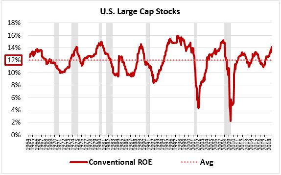
The ROE averages out to more than 12% per year. We know this number is exaggerated because it's roughly twice as high as other return parameters for the index: the total return, the return from growth and dividends, the average earnings yield, and so on.
The same distortion arises in equity-based measures of valuation such as the popular price-to-book (P/B) ratio. For our purposes, "book value" and "equity" refer to the same thing. Because equity is not upwardly adjusted for inflation under U.S. GAAP, nominal share prices rise faster than book values over time, producing inflated P/B ratios. The chart below illustrates the distortion:
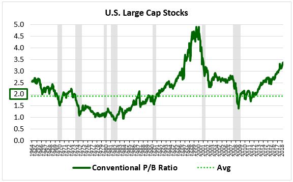
In theory, stocks should trade at par to their book values, with average P/B ratios of 1.0. The approximate 2.0 average observed in the chart is therefore twice as high as it should be.
Summary of Section 2: Introducing Integrated Equity
In the second section of the piece, I'm going to introduce and explain a methodology for correcting the inflationary distortions associated with conventional ROE and P/B measures. This methodology, which I'm going to refer to as "integrated equity", deconstructs book values into constituent units of retained earnings and individually adjusts those units for inflation. It then integrates the units back together to form a properly inflation-adjusted book value measure.
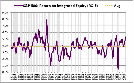
The chart below shows how ROE changes when book value is calculated using the integrated equity methodology. We refer to the improved ROE measure that it generates as "ROIE", short for return on integrated equity:
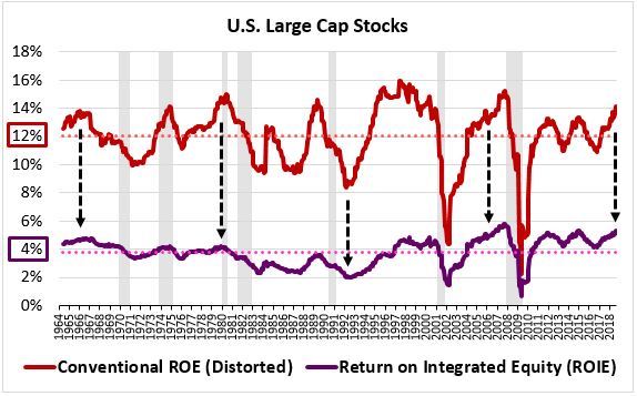
As you can see, the measure drops from an average of roughly 12% to an average of roughly 4%.
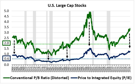
We refer to the improved P/B measure that the framework generates as the "P/IE" ratio, short for price to integrated equity. The measure's average over the period falls from 2.0 to roughly 0.60:
A major advantage to the integrated equity methodology is that it doesn't require access to reported book value information. It calculates book values on its own, from scratch. All it needs for the calculation are two inputs: earnings and dividends. It can therefore generate historical profitability data all the way back to January 1871, the first month of available earnings and dividend information for U.S. equities:
Official data on the profitability of U.S. corporations begins in the late 1920s. The integrated equity methodology pushes that start date back to 1871, allowing us to explore a period of market history that would otherwise be hidden from us.
Summary of Section 3: The Profitability Gap
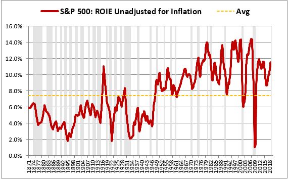
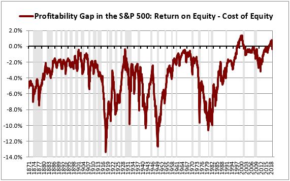
In the third section of the piece, I'm going to explore a discrepancy that emerges when the integrated equity methodology is used to generate improved measurements of return on equity. This discrepancy is illustrated in the chart below, which shows the ROIE of the S&P 500 alongside its earnings yield from 1871 through 2018:
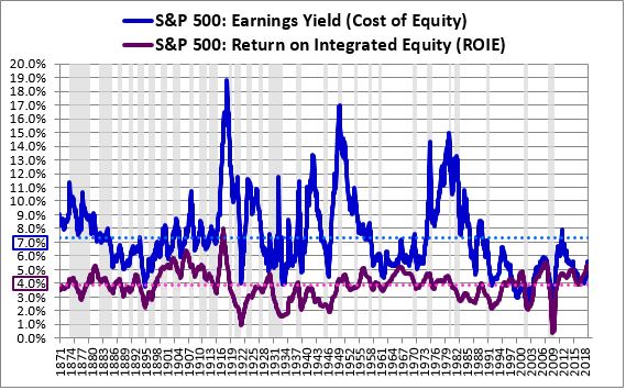
The ROIE, shown in purple, represents an approximation of the return that the index could have generated by investing. The earnings yield, shown in blue, represents an approximation of the index's cost of equity, i.e., the return that it could have generated by reducing its equity through dividends and share buybacks. As you can see, the ROIE is significantly lower than the earnings yield in almost every period of the chart. We refer to this unexpected result as the profitability gap. Its occurrence violates economic theory, which predicts that corporations will only invest when the expected return on the investment exceeds the cost, including the opportunity cost of not being able to do other things with the capital.
The simplest available explanation for the profitability gap is that corporate investment and corporate capital allocation are inefficient. Corporations unwittingly deploy capital into wasteful, low-return projects when they could earn much higher rates of return by recycling capital back into their prices through dividends and share buybacks. We refer to this explanation as the "inefficient investment" hypothesis. In the section, I'm going to explore the evidence for and against it, including evidence from different sectors, industries, countries, factors and periods of history:

I'm ultimately going to reject the inefficient investment hypothesis as an explanation for the profitability gap. It may explain a minor portion of the gap, but it's unlikely to represent the gap's primary cause.
Summary of Section 4: The Overstated Earnings Hypothesis
In the fourth section of the piece, I'm going to examine a better explanation for the profitability gap. This explanation, referred to as the "overstated earnings" hypothesis, holds that the gap is an illusion that results from the incorrect reporting of earnings. Each quarter, when companies tell us that they're earning specific amounts of money, they're actually exaggerating--the true amounts that they're earning are significantly less. Mathematically, the exaggeration creates an illusory increase in the earnings yield and an illusory decrease in the return on equity, giving rise to an illusory profitability gap.
Most people react to the overstated earnings hypothesis with confusion and skepticism. They wonder how it could be possible for corporations to overstate their earnings year after year without anyone finding out. They also wonder why overstated earnings would cause returns on equity to be depressed rather than elevated. If these are the types of questions you have right now, don't worry: I'm going to carefully answer all of them in the piece.
In explaining the overstated earnings hypothesis, I'm going to focus on a critical deficiency that exists in the way that depreciation is measured. Depreciation expenses in GAAP are calculated using the historical costs of assets, as opposed to the current values. In the presence of inflation, these expenses become understated, causing earnings to become overstated.
To corroborate this overstatement, I'm going to share the results of an accounting simulation that successfully generates an illusory profitability gap in a hypothetical index that doesn't actually have one. The simulation begins by modeling an inflation-free earnings process with parameters that match the actual parameters of the S&P 500. It then introduces inflation into that process and recalculates nominal earnings using GAAP accounting rules. At equilibrium, the calculated nominal earnings become significantly overstated relative to reality, causing a profitability gap to emerge. This gap ends up matching the actual profitability gap observed in the actual S&P 500, suggesting that the actual gap is an illusion as well:

To conclude the section, I’m going to attempt to quantify the average degree of earnings overstatement that has occurred over the course of market history. I’m going to arrive at a number somewhere between 20% and 25%.
Summary of Section 5: Implications for Investors and Allocators
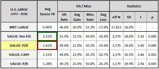
In the fifth section of the piece, I’m going to explore the implications that the overstated earnings hypothesis carries for individual stock selection. In practice, the hypothesis points to a conclusion that respected value investors frequently emphasize: free-cash-flow (FCF) is better than other fundamentals in the measurement of value. I’m going to test that conclusion in the factor space, to see whether it holds up:
I’m then going to explore the implications that the hypothesis carries for the valuation of the overall stock market. Contrary to what some might initially expect, the hypothesis is bullish for the current market’s valuation. Free-cash-flow as a share of earnings is much higher today than it was in prior periods of history, suggesting that today’s earnings are less overstated:
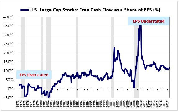
If today’s earnings are less overstated, then today’s market deserves a higher multiple.
Summary of Section 6: Using the Integrated Equity Methodology to Value Markets and Individual Stocks
In the final section of the piece, I’m going to test the ability of the P/IE ratio to predict future returns in the S&P 500. The predictive performance is shown below:

The metric’s correlation with future 10-year S&P 500 returns is 0.926, stronger than the Shiller CAPE and every other popular valuation metric tested in the sample.
To experiment further with the overstated earnings hypothesis, I’m going to discount historical reported earnings to undo the estimated 25% average overstatement that has occurred across history. I’m going to recalculate the P/IE ratio under the discounted numbers, to see if the return correlations improve. As you can see, they become exceptionally tight:

I’m going to conclude the piece by testing the P/IE ratio as a value factor in individual stocks. As expected, the metric outperforms its primary competitor, the price-to-book ratio. But it underperforms the simple price-to-earnings (P/E) ratio, even as it purports to smooth out the P/E ratio’s cyclical fluctuations.
Drawing on insights from Factors from Scratch and Alpha Within Factors, I’m going to explain why it underperforms, and also why the Shiller CAPE underperforms in similar contexts.
Preliminary Clarifications and Definitions
Unless stated otherwise, the following clarifications will apply throughout the piece:
- Inflation-Adjustment: All numbers and rates of return will be adjusted for inflation.
- Geometric Averaging: All averages will be geometric averages, which are the proper averages to use when analyzing returns. See this footnote1 for the definition of a geometric average.
- Reinvested Dividends: All references to dividend returns will rest on the assumption that dividends are immediately and fully reinvested at market prices.
- Market-Cap Weighting: All indexes will be weighted by market capitalization.
Certain arguments in the piece will depend on claims that not every reader will agree with. Examples of such claims will include the claim that reinvested dividends and share buybacks are functionally equivalent to each other on a pre-tax basis, or that the corporate sector needs to invest in order to grow its earnings in real terms, or that the market’s average earnings yield is a proxy for its average cost of equity. To save space in the main piece, I’m going to move their treatment to Appendix A. In that appendix, I’m going to intuitively demonstrate them using the example of a simple apartment business. As a general rule, if an idea presented in the piece doesn’t initially make sense to you, go to Appendix A—it will probably be explained there:
One of the most important concepts in the piece will be the concept of equity. We need to precisely define it. For our purposes, a corporation’s “equity,” also referred to as its “book value,” is the total amount of capital that shareholders have invested into it.2 This amount is typically identical to the total amount of capital that the corporation has invested into the economy on a net basis, since the corporation invests, or is at least expected to invest, all of the capital that shareholders provide it with. When we calculate the return on equity, we’re attempting to quantify the return in earnings that has been generated on that investment.
Simplistically, the equity funding that shareholders provide to corporations can be separated into two categories:
- Paid-In Capital: Capital that corporations receive from shareholders through initial capitalizations and new share sales (e.g., initial public offerings, follow-on offerings, etc.)
- Retained Earnings: Earnings that belong to shareholders and that would otherwise be distributed to them as dividends, but that instead get kept inside of corporations, to be invested on their behalf.
The second category, retained earnings, serves as the foundation for the integrated equity methodology. To calculate it for a given period, we take the difference between earnings and dividends over the period.
Section 1: The Problem with Conventional Equity-Based Measures of Profitability and Valuation
The conventional method for calculating a company’s return on equity (ROE) is to divide its net income for common shareholders, obtained from its income statement, by its common shareholder equity, obtained from its balance sheet. This approach creates severe distortions, which we illustrate below.
Conventional Return on Equity: An Illustration of the Distortions
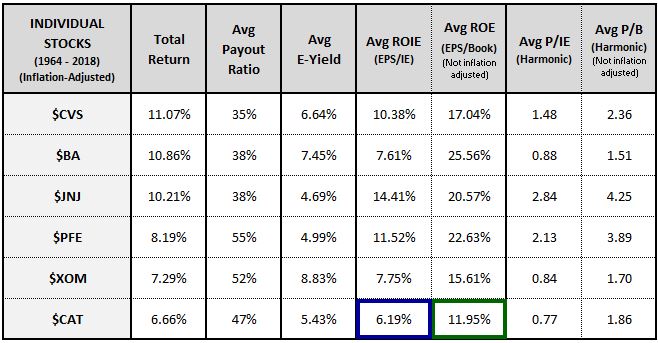
To illustrate the distortions, consider the following chart, which shows the ROE for Caterpillar, Inc., ($CAT), a company that designs and manufactures industrial machinery:
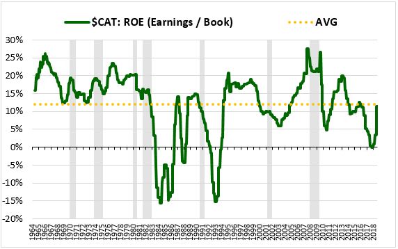
From 1964 through 2018, Caterpillar generated an average ROE of roughly 12% per year. This number is quite strong, especially when we consider that it includes the effects of large losses incurred in the 1980s and early 1990s. Unfortunately, it significantly overstates the true profitability of Caterpillar’s investments. We know it’s an overstated number for two reasons:
First, it’s almost double the 6.7% total return that Caterpillar generated over the period3. If Caterpillar actually managed to generate a 12% average return on its investments, then its shareholders should have received a return commensurate with that number in their actual accounts. But they didn’t receive anything even close.
Second, it’s more than twice the 5.4% average earnings yield that Caterpillar traded at over the period. To a first approximation, we can think of a company’s average earnings yield—earnings divided by price—as the average return that it would have delivered to its shareholders if it had used 100% of its earnings to pay dividends or buy back shares (the two are functionally equivalent—(see Appendix A: Claim #1). Since the return that a corporation generates by buying back shares is identical to the cost that it incurs by selling shares, we can treat the average earnings yield as an approximation of the average cost of equity for corporations (see Appendix A: Claim #3). The quoted numbers therefore suggest that Caterpillar’s average return on equity (12%) over the period was more than double its average cost of equity (5.4%).
If Caterpillar’s return on equity was twice its cost of equity, then why didn’t the company take advantage of it? The company could have suspended its dividend and aggressively sold new shares in the market, using the proceeds to invest at the much higher rate of return. Instead, it did the opposite, paying out roughly half of its earnings as dividends and using a significant portion of the remainder to buy back its own shares. Amazingly, its share count today is less than in January 1964, even with the effects of employee stock issuance included.
The actual skin-in-the-game decisions of Caterpillar’s management, which are far more reliable than any abstract accounting number, suggest that the company’s true average ROE was significantly less than the 12% depicted in the measure. Of course, this doesn’t mean that the company’s financial reports are incorrect. They’re perfectly consistent with U.S. accounting standards. What’s incorrect is our way of measuring ROE under those standards. In the next subsection, I’m going to explain the cause of the error.
The Causes of the Distortion: Historical Cost Accounting and Inflation
As a general rule, ROE numbers obtained by dividing earnings by book values tend to be significantly overstated relative to reality. To understand the origins of this distortion, we need to understand how accounting in the United States and in most parts of the world is carried out. There are two general frameworks for accounting: replacement cost accounting and historical cost accounting. In a replacement cost framework, corporations continually adjust the stated values of their assets to match the current values of those assets, conceptualized as the cost of replacing them. In a historical cost framework, corporations permanently record the values of their assets as the initial cost that was paid for them.4
To illustrate the difference with a real-world example, suppose that you bought a beachfront home in Orange County, California in the 1950s for $10,000. In a replacement cost framework, you would carry that home on your “personal” balance sheet at whatever the current cost of creating or acquiring a home just like that—in that location—would be. Today, that cost might be something like $5,000,000. So you would carry the home as an asset valued at $5,000,000. In a historical cost framework, you would carry the home at the original price that you paid for it—$10,000. A big difference, especially when it comes time to pay taxes.
The advantage to replacement cost accounting is that it yields results that better depict the true economic value of a company’s assets. The disadvantage is that it’s inherently hypothetical and subjective. Unless an asset trades actively in a market, there’s no easy way to estimate its “replacement cost.” The concept can therefore be manipulated and abused to paint a false picture of a company’s health and performance.
The advantage to historical cost accounting is that it’s objective and unambiguous. The cost of something is a known transaction that can be checked and verified, a fact that helps protect the method from manipulation and abuse. The disadvantage is that the true economic value of a thing will change over time, including in the upward direction. Historical cost approaches are unable to properly reflect that change.
Prior to the Great Depression, accounting in the United States was not the standardized, well-regulated practice that it is today. Firms were able to use favored accounting methods to inflate their apparent performances without fear of reprisal. During and after the Great Depression, a narrative emerged that partially blamed replacement cost accounting for the stock market crash and economic downturn that had occurred. The claim was that companies had exploited the nuance and ambiguity inherent in replacement cost approaches to significantly overstate their earnings and book values. The overstatement caused investors to wrongly think that the companies deserved to trade at exorbitant prices, contributing to the bubble.
When the Securities and Exchange Commission (SEC) was created in 1934, one of its core tasks was to enforce the newly established rules on financial reporting. Given the freshness of the country’s experience in the Great Depression, both the SEC and the accounting industry took a strong stand in favor of the historical cost standard.5 That standard has remained the official SEC-enforced GAAP standard ever since. The inherited equity data that today’s investors and researchers use—which includes the data presented above for Caterpillar—follows that standard.6
Why does this matter? It matters because it affects the relationship between book values and other fundamentals over time. Macroeconomic quantities such as prices, sales and earnings tend to track closely with each other. We therefore tend to assume that book values will track with these quantities as well. But in a historical cost framework, that assumption isn’t necessarily going to be true. A book value in a historical cost framework is not a quantity that is tethered to current economic conditions. Rather, it’s a historical record—specifically, a record of past investment transactions at their original cost. In theory, it’s capable of tracking with other macroeconomic aggregates, but it doesn’t have to track with them.
The problem emerges when inflation is introduced. Prices, sales and earnings tend to rise with inflation. Holding everything else constant, higher prices in the economy mean higher selling prices for companies which mean higher nominal sales and therefore higher nominal earnings. Because book values are historical records of past transactions, they don’t follow this chain. They have no link to inflation. Consequently, as companies make investments, the nominal earnings associated with those investments, which get a boost from inflation, tend to grow faster than the reported book values of the investments themselves, which are stuck at historical cost. This divergence causes measured ROEs—which are calculated by dividing earnings by book values—to become inflated.
To be clear, inflation doesn’t cause measured ROEs to go to infinity. Instead, it causes them to mathematically stabilize at overstated levels (see Appendix A: Claim #4). The eventual degree of overstatement will depend, among other things, on the amount of historical inflation that has taken place, the age of the company in question, its payout ratio, and the rate at which it depreciates and turns over its assets. Caterpillar is a very old company, with roots that go back to the late 19th century. Unlike newer companies such as Facebook and Twitter, the historical costs of many of its assets are costs that were paid a long time ago, when prices were orders of magnitude lower than they are today.
Importantly, the problems introduced by inflation extend to all book-value-based metrics—not just ROE, but also the popular price-to-book (P/B) ratio. When we track the P/B ratios of companies, we notice that the average P/B ratio across the market tends to be quite elevated. In theory, we would expect it to come in somewhere around 1.0, with stocks generally trading at par to their equity values. In practice, however, we find P/B ratios averaging out to numbers in the 2’s, 3’s, or even higher. This happens because the book values are being stated at historical cost. Accumulated inflation is causing them to become understated in current price terms.
Section 2: Introducing Integrated Equity
For the purpose of measuring corporate investment profitability, historical cost accounting is actually preferable to replacement cost accounting. It’s preferable because it calculates book value in a way that matches the total amount of money that shareholders have invested into a company (and that the company, conversely, has invested on their behalf). We need to know what that amount is in order to correctly measure the profitability of the associated investments.
The problem with traditional historical cost accounting is that it doesn’t adjust historical costs for inflation. It therefore computes book values from terms that are inconsistent with each other across history. In this section, I’m going to introduce a methodology for correcting this problem. The methodology will allow us to determine the inflation-adjusted historical cost book value of any company or index back to its inception.
The Wrong Way to Inflation-Adjust a Book Value
The standard way of adjusting a historical transaction for inflation is to multiply it by the increase in the consumer price index (CPI) that has occurred since the transaction occurred.7 Unfortunately, we can’t use this approach to adjust a book value for inflation because a book value is not a single transaction that occurred on a single date. Rather, it’s a sum of transactions that occurred on a set of prior dates, going back years, decades and sometimes even centuries. Each of those transactions will have occurred at a different CPI level, and therefore each transaction will need to be adjusted using a different factor.
Returning to the example of Caterpillar, let’s suppose that we want to build an inflation-adjusted measure of the company’s 1983 book value, expressing that value in 2018 dollars. The table below shows the history of prior net investments that made up the company’s book value as of that date8:
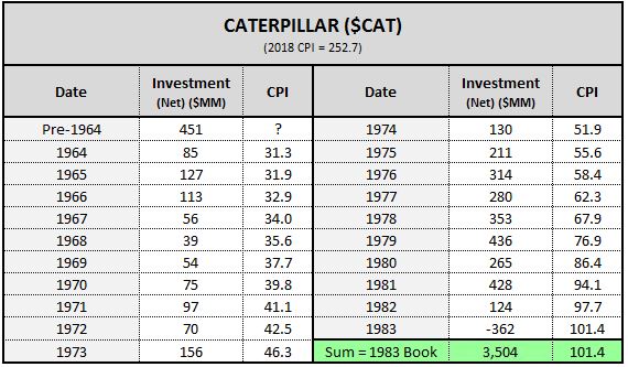
We want to express the $3,504MM number in 2018 prices. In any other context, we would simply multiply it by 2.5, which is the increase in the CPI that occurred from 1983 to 2018 (= 252.7 / 101.4). But we can’t do that here. The $3,504MM number is not a transaction that occurred at 1983 prices. Rather, it’s a sum of transactions that occurred on prior dates, at the price levels of those prior dates.
Consequently, if all we do is multiply $CAT’s 1983 book value by the 2.5X CPI increase that occurred from 1983 to 2018, we will be under-adjusting every investment contained in its book value that occurred before that date. For example, we will effectively be treating the $127MM investment that occurred in 1965 as if it had been $315MM in today’s dollars (= $127MM * 252.7 / 101.4). The truth, however, is that it was more than three times that amount, $1,066MM (= $127MM * 252.7 / 31.9).
Deconstructing Book Values into Units of Retained EPS
To properly adjust $CAT’s book value for inflation, we need to adjust each net investment transaction that it was formed from based on the specific year in which that transaction occurred. We therefore need a way to deconstruct the company’s book value into a collection of date-specific historical net investment transactions. In this subsection, I’m going to describe an efficient way to do that.
Recall that we defined equity, i.e., book value, as the cumulative sum of retained earnings and paid-in capital. Together, these two funding sources finance all of the net investments of a corporation. If we can quantify the occurrence of each funding source across history, then we can quantify the corporation’s history of net investments. And if we make the reasonable assumption that the funding sources were invested at or around the time that they came into the company, then we can know what date to use when adjusting them for inflation.
What we need to do, then, is determine $CAT’s history of retained earnings and paid-in capital. Determining the retained earnings part is easy—it’s given by the difference between earnings and dividends in each period. Determining the paid-in capital part is more complicated. We’re going to have sift through a lot of messy data to find it.
Fortunately, if we keep our focus strictly on per share quantities—specifically, book value per share—then we can get away with ignoring the paid-in capital part. Paid-in capital increases book value, but it also increases share count, reducing the effect on book value per share.
Events that affect paid-in capital, such as share buybacks and dilutive offerings, cause changes in book value per share when the shares are bought or sold at prices above or below book value per share. In a large, diversified index—the kind of index that we're going to use the methodology on—the effects of purchases and sales at different price points relative to book tend to offset, minimizing the net impact on the aggregate measure.9
To deconstruct book values into date-specific investment transactions, what we need to do, then, is specify the history of retained earnings per share (EPS). That history will be approximately equal to the per share history of net investments.
To demonstrate the point in practice, the chart below shows two lines. The first line, depicted in green, is the nominal reported book value per share of the overall U.S. Large Cap Stock index from 1964 through 2018. The second line, depicted in red, is the nominal reported book value per share of the same index in 1964 plus the running total of nominal retained EPS that the index accumulated in subsequent years.10
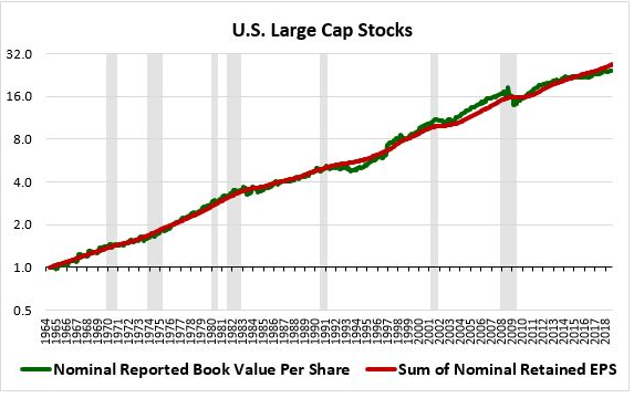
The two lines track each other very closely, confirming that reported book value per share can be effectively represented as the cumulative sum of retained EPS over time.11
Completing the Calculation: The Initial Equity Problem
The methodology that we’re going to use to construct inflation-adjusted book values consists of three basic steps:
Step (1): Deconstruct book values into prior retained EPS events.
Step (2): Adjust those events for inflation based on the dates in which they occurred.
Step (3): Reconstruct book values by adding the inflation-adjusted retained EPS events back together.
I’m going to refer to this methodology as the “integrated equity” methodology. The name is appropriate because the methodology calculates equity by integrating the individual parts of equity, i.e., the individual units of retained EPS that have been accumulated and invested over time. The integrated equity methodology stands in contrast to the conventional, reported way of determining equity, which is to simply read it off the balance sheet.
The table below illustrates how the integrated equity methodology is carried out. We want to determine a company’s inflation-adjusted book value on some date—in this case, $CAT’s inflation-adjusted book value as of 1983, expressed in 2018 prices. We start by specifying the retained EPS numbers that $CAT generated in each year prior to 1983. We then inflation-adjust those numbers up to 2018 prices based on the years in which they occurred. Finally, we add the inflation-adjusted retained EPS numbers together. We end up with a properly inflation-adjusted measurement of the company’s 1983 book value:
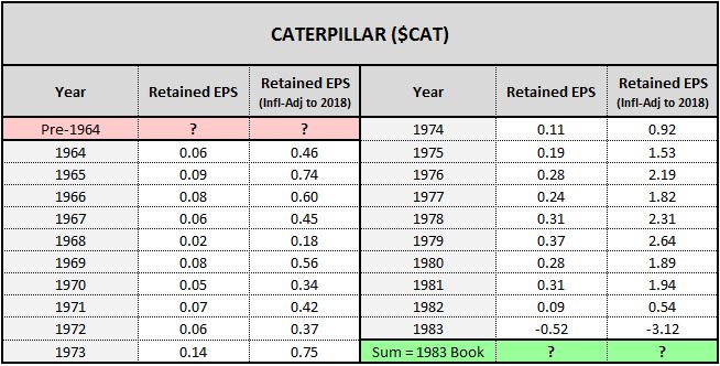
Unfortunately, we’re missing a critical piece of information in the calculation: the company’s retained EPS for years prior to 1964, the earliest year that we have earnings and dividend data for. The company’s history of retained EPS goes much farther back than that date—in theory, it goes all the way back to 1892, the year that Benjamin Holt incorporated the Holt Manufacturing Company, the original seed of today’s Caterpillar. We need that history to complete the calculation.
To be clear, we know what the company’s reported book value per share was in 1964—around 0.36. We therefore know what it’s cumulative history of nominal net investment was up to that date. But we don’t know when in the 1892 to 1964 period those investments actually occurred. Consequently, we can’t properly adjust them for inflation.
In any calculation of this type, we’re going to run into this same problem, which we refer to as the “initial equity” problem. There’s going to be some date when our earnings and dividend data begins. We won’t know anything about the retained EPS events that occurred prior to that date. Consequently, we won’t be able to specify or inflation-adjust any of the associated investments. The company’s inflation-adjusted equity value on the date will therefore be unknown to us, preventing us from calculating inflation-adjusted equity values for subsequent dates. The problem is illustrated in the table: because we don’t know the pre-1964 values highlighted in red, we can’t complete the retained EPS summation, and therefore we can’t calculate the 1983 book value highlighted in green.
In the case of $CAT, the initial equity problem is alleviated by the fact that the company’s pre-1964 equity is only a small contributor to its 1983 equity. The company grew dramatically from 1964 to 1983, reducing the relative importance of its pre-1964 investments to its 1983 total. Still, those earlier investments make a difference to the calculation.
Solving the Initial Equity Problem: A Calibration Technique
It turns out that we can accurately estimate the initial equity of a company by calibrating it to match other data that we have access to. To avoid burdening readers, I’ve transferred the bulk of the description of the technique into the appendices. In this subsection, I’m going to briefly summarize the logic behind it, so that readers can determine whether they want to explore it further.
We start by developing a metric for measuring incremental ROE, which we refer to as the return on differential equity, or “RODE.” The RODE is immune to the initial equity problem because it’s calculated from the difference in equity between dates rather than from an outright value on a given date. We describe it in detail in Appendix B.
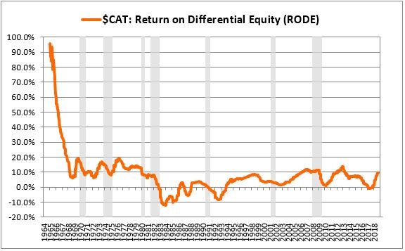
After charting the RODE, we test out different possible values for the initial equity in the integrated equity calculation, using those values to generate different charts of ROIE. We describe this process in detail in Appendix C.
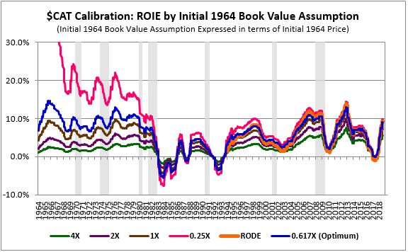
We then choose the initial equity value associated with the ROIE chart that exhibits the tightest possible fit with the RODE chart. For Caterpillar, the optimal initial 1964 equity value ends up being 0.617 times the company’s initial inflation-adjusted 1964 price. That value represents the best available estimate of the sum of the inflation-adjusted paid-in capital and retained EPS events that occurred in the company prior to 1964. We therefore assign it as the initial equity value in the integrated equity calculation.
In this process, we’re effectively backfitting the initial equity assignment to produce a result that’s maximally consistent with ROE data calculated through a different method, the RODE method. Note that what I’ve shared here is just a high-level summary—if you’d like to see a more detailed description of the technique, please refer to the following appendices:
Results for Large Cap Companies
When we divide $CAT’s inflation-adjusted earnings by the inflation-adjusted book value generated using the integrated equity methodology, we obtain the ROE measure shown below in blue:
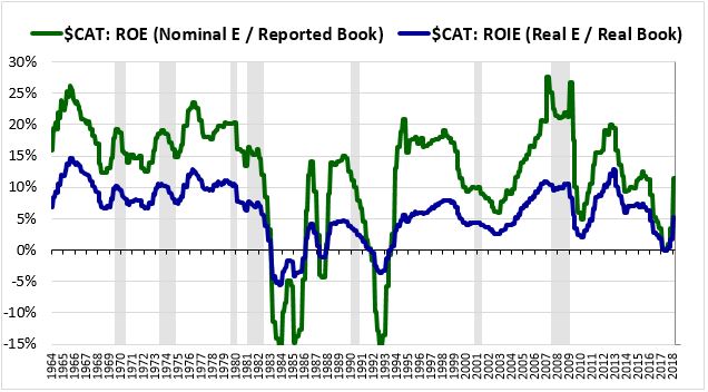
We refer to this measure as the return on integrated equity (ROIE). It’s lower than the conventional unadjusted ROE depicted in green because it’s derived from a properly inflation-adjusted book value rather an understated book value calculated using inconsistent price terms.
The table below provides a sample of the data that the integrated equity methodology produces for different large cap companies:
As you can see, the methodology eliminates the distortions highlighted earlier. In contrast to the exaggerated ROE numbers calculated using traditional nominal methods, the integrated equity methodology produces ROIE numbers that make more sense and that fit more closely with other information that we have about the companies—their actual returns, their average cost of equity, and so on. Similarly, in contrast to the obviously exaggerated P/B ratios calculated using the traditional nominal approach, the methodology produces P/IE ratios that are much closer to unity, 1.0.
In addition to its inflation-related benefits, the integrated equity methodology offers several accounting-related benefits. First, when calculating retained EPS, it uses an earnings series that excludes (or that can be chosen to exclude) non-recurring accounting items. It can therefore reduce distortions associated with asset writedowns. GAAP rules on asset writedowns represent an asymmetric departure from the historical cost standard. If an acquired asset falls in value (think: HP’s acquisition of Autonomy), the asset is effectively required to be carried at replacement cost. But if the asset rises in value (think: Google’s acquisition of YouTube, or Facebook’s acquisition of Instagram), it’s required to be carried at historical cost. This asymmetric approach produces paradoxical outcomes in which companies that have made bad investments experience large declines in their book values and therefore large increases in their calculated ROEs.
Second, the methodology eliminates the book value distortions introduced by share buybacks. Mathematically, when share buybacks are conducted at prices above book value, book value per share shrinks. This wouldn’t necessarily be a problem, except for the fact that GAAP book values tend to be persistently understated across the market. Most companies trade at prices that are higher than their stated book values, and therefore most share buybacks end up causing artificial book value per share shrinkage to occur. The shrinkage amplifies the distortions that we’ve described up to this point—book values that were already understated become even more understated.
Instead of treating share buybacks as an outflow that changes book value, the integrated equity methodology treats them as a growth-producing investment just like any other, indistinguishable from any other deployment of capital that might generate EPS growth. The methodology doesn’t change anything in response to them—in fact, it doesn’t even notice them. All its notices are the retained earnings used to fund them and the subsequent EPS growth that they bring about, which are the only things that matter when measuring ROE. Consequently, when company’s conduct share buybacks at market prices significantly above book value per share—a frequent occurrence, given that reported book values tend to be understated—the artificial book value per share shrinkage that would otherwise occur is avoided.
If you examine the table, you’ll notice that Boeing ($BA) has an average reported ROE in the stratosphere—almost 26%. That ROE is not reflective of the company’s actual investment performance but is instead the result of a series of fictitious accounting losses incurred over the last two decades mixed in with a history of share buybacks conducted at artificially high reported P/B ratios. Together, these processes have caused the company’s reported book value per share to shrink to almost nothing, dramatically inflating the company’s reported ROE. The shrinkage is illustrated in the chart below:12
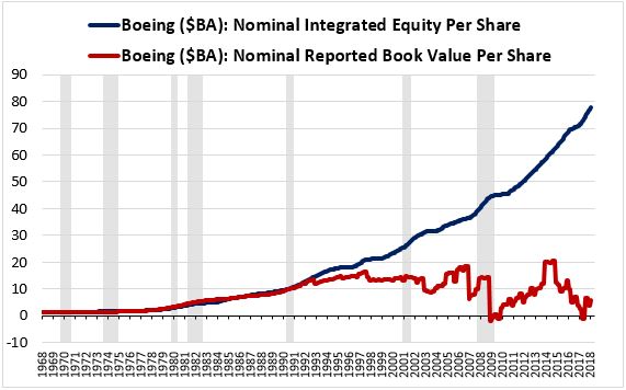
The blue line represents $BA’s nominal book value per share calculated using the integrated equity methodology without adjusting any of the retained EPS terms for inflation. The red line represents $BA’s officially reported book value per share. As you can see, the two lines initially track each other very closely, confirming the point we made earlier that nominal book value per share can be accurately represented as the historical sum of nominal retained EPS. But then, starting in the mid-1990s, the company’s reported book value implodes, falling completely off its prior trend. This implosion is the result of changes in accounting rules combined with the company’s increased reliance on share buybacks.
Applying the Methodology to the S&P 500
In this subsection, we’re going to apply the integrated equity methodology to the S&P 500. We’re going to start by applying the methodology without adjusting the retained EPS terms for inflation. The monstrous result that we obtain will confirm the unreliability of the conventional ROE measures that investors typically use. We’re then going to apply the method with proper inflation-adjustment, noting the clean, coherent, symmetric result that follows.
The chart below shows the conventional, inflation-unadjusted reported ROE of the OSAM U.S. Large Cap Stock index from 1964 through 2018. This index is a market-cap-weighted proxy for the S&P 500 that comes with readily available reported book value information. To calculate the ROE of the index, we divide the index’s aggregate nominal earnings by its aggregate reported book value:
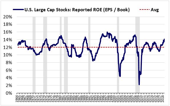
As was the case earlier with $CAT, the numbers appear to be exaggerated—a 12% average ROE doesn’t make sense for an index with an approximate 6% total return and an approximate 6% average cost of equity. Other than that discrepancy, however, the chart appears to be relatively normal. It doesn’t look like a chart that was created from a grossly flawed calculational process.
To see how this chart got to where it is, we can use the integrated equity methodology to build a similar chart for the S&P 500 that extends much farther back in time. To generate such a chart, all we need to do is apply the integrated equity methodology without adjusting any of the retained EPS numbers for inflation. Because the methodology makes its calculations strictly from earnings and dividends, we can take the chart all the way back to the first S&P 500 data point, January 1871.13 If we do that, we will obtain the following result:
As you can see, this chart is a lopsided mess. Unless we’re willing to believe that the U.S. corporate sector experienced a profitability phase shift during the late 1940s, we can’t take it seriously. But notice that it’s roughly the same chart as the previous OSAM Large Stock chart, just taken back farther in time.14 The chart below shows an overlay of the two charts:
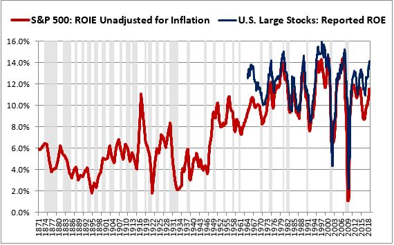
The inflation unadjusted ROIE for the S&P 500 (red) and the reported ROE for the OSAM U.S. Large Stock index (blue) are essentially the same measures. One just goes back farther into the past, courtesy of the methodology. In taking the chart back, we’re able to see the way in which inflation has distorted it.
Notice that the biggest jumps in the chart occur in the decades that had the highest inflation, with the first jump occurring during the post-war inflation of the late 1940s and the second jump occurring during the inflation of the 1970s and early 1980s. Given the slow overall pace of asset turnover, the lingering effects of that inflation don’t quickly go away—they stay in the data and are still partially there today.
Now, let’s see what happens when we properly inflation-adjust the retained EPS terms in the integrated equity calculation. We obtain the clean, coherent, mean-reverting ROIE chart shown below—a dramatic improvement:

The period of the chart that we haven't seen before is the period prior to 1929, the starting year for the profitability data given in the National Income and Products Accounts (NIPA). Looking back at the pre-1929 period, we see that ROIEs in the period were roughly on par with where they are today. They were especially high in the run up to the U.S. entry into World War I, at which point they abruptly crashed, partly in response to the passage of a steep excess profits tax. They subsequently rebounded during the roaring twenties into the September 1929 stock market peak.
Summarizing and Checking the Results
The table below provides a summary of relevant data for the S&P 500 from January 1871 through December 2018:
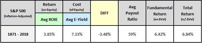
The column shaded in green shows the index's average return on equity calculated using the integrated equity methodology (ROIE). The column shaded in blue shows the index's average cost of equity, which we approximate as its average earnings yield. The column shaded in yellow shows the difference between the index's average return on equity and its average cost of equity. The final three columns show the index's average payout ratio, its average fundamental return from growth and dividends (with the effects of valuation changes removed) and its average total return (with the effects of valuation changes included).
We can check the validity of the numbers in the table using a simple calculational method called the "payout ratio" method. To check the average return on equity number, we take the index's rolling average EPS growth over the period, 1.66% per year, and divide that growth by the approximate 41% of earnings that the index historically invested into growth. This technique effectively "scales up" the index's growth to reflect what that growth would have been if the index had invested 100% of its earnings into it. We end up with a number equal to 4.02%. That number is the fundamental return that accrued to shareholders "per unit of earnings deployed into investment", which is the same as "per unit of equity " or "per unit of book value." It's therefore an indirect measure of the index's return on equity over the period. As expected, it roughly checks with the 3.85% number shown in the table.
To check the average cost of equity number, we take the index's average return from dividends over the period, 4.52%, and divide it by the approximate 59% of earnings that the index historically devoted to paying dividends. We end up with a number equal to 7.65%. That number is an estimate of the return that the index would have generated if it had paid all of its earnings out as dividends, to be reinvested at market prices, or if it had done the equivalent by buying back shares directly at market prices.15 It's the return embedded in those prices, making it an indirect measurement of the index's cost of equity. As expected, it checks with the 7.33% number shown in the table.
For comparison, the table below shows results obtained through the integrated equity method alongside results obtained through the payout ratio method. The return on equity terms are shaded in light green and the cost of equity terms are shaded in light blue. As you can see, the terms line up very closely with each other across the two methods:
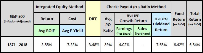
In summary, we can be confident in the analytic accuracy of the numbers calculated via the integrated equity method because they match numbers calculated using an entirely different method, the payout ratio method. For interested readers, I explain the payout ratio method in greater detail in:
To allow for validity checks, the appendix contains sector, industry, and country data generated using both methods. It also contains sales-based results, allowing us to quantify the impact that recent profit margin changes have had on ROIEs.
Section 3: The Profitability Gap
In theory, the corporate sector’s return on equity should be greater than or equal to its cost of equity. However, when we measure the actual numbers, we find that the opposite is true. The corporate sector’s measured cost of equity is significantly higher than its measured return on equity. In this section of the piece, we’re going to investigate this puzzling result.
The Profitability Gap Explained
The chart below shows the earnings yield and the ROIE of the S&P 500 from January 1871 through December 2018:
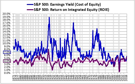
The average earnings yield over the period, shown as the dotted blue line, comes out to 7.33%. That number is an approximation of the index’s average cost of equity, which we can think of as the average return that it would have earned if it had recycled all of its earnings back into its price through dividends and share buybacks (see Appendix A: Claim #3). The average ROIE over the period, shown as the dotted purple line, comes out to 3.85%. That number is an approximation of the index’s average return on equity, which we can think of as the average return that the index would have earned if it had directed all of its earnings into investment.
We refer to the gap between these two measures as the “profitability gap.” Over the full course of market history, the gap averages out to 3.48% (=7.33% - 3.85%). The existence of the gap suggests that corporate investment has not been profitable enough to justify the missed opportunity to pay dividends and buy back shares. Per unit of earnings deployed, corporate investment generated an annual return that was 3.48% less than the return that could have been delivered through those alternatives.16
Given the size of the profitability gap, why did corporations historically deploy almost half of their earnings into investment? Why didn’t they instead deploy all of their earnings into dividends, or use all of their earnings to buy back shares (after doing so became legal)? That’s the question that we have to answer. To frame the question in terms of the cost of equity and the return on equity, if the corporate sector’s average cost of equity was 3.48% higher than its average return on equity, then why did it expand its equity by retaining and reinvesting its earnings? Why didn’t it instead contract its equity, shrink it, give it back to its shareholders? If the calculated numbers are correct, that would have been the most accretive thing to do.
In addition to showing up in profitability data, the profitability gap shows up in valuations. Consider the chart below, which shows the ratio of the S&P 500’s price to its integrated equity (“P/IE”) from January 1871 through December 2018. Recall that the P/IE ratio is similar to the price-to-book ratio, except that it uses an inflation-adjusted book value calculated using the integrated equity methodology:
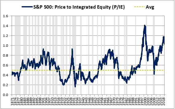
On a harmonic basis, the ratio averages out to roughly 0.50 over the period. The implication is that equity that historically got put into companies at par ended up trading on average in the market at 50% of par. That’s how corporate investments that originally offered a 3.85% return got transformed into dividend and share buyback opportunities offering a 7.33% return—the market, in its apparent irrationality, discounted the companies and the equity investments inside them, increasing their implied returns.
So, it’s not just corporations that are to blame for the profitability gap. It’s also investors. Why are they selling stocks at average prices below the par value of equity? Why is $1 in the primary equity market—e.g., the IPO market or the retained earnings market—only worth an average of 50 cents in the secondary equity market, i.e., the publicly traded market? Why are investors creating irrational price conditions in which companies can generate a 3.48% excess return over new investment by contracting their equity, i.e., giving it back to shareholders?
It’s important to emphasize that the irrational outcome that we’re confronted with here is a direct analytic consequence of claims that corporations themselves are making. They’re claiming to have earned money on behalf of their shareholders. But they aren’t paying all of that money out to their shareholders. Instead, they’re keeping a large portion, investing it back into their businesses. They claim that the underlying value of the money is being retained in the process. But when we add up the actual numbers, we find that they don’t add up. A significant amount of shareholder value is being lost somewhere.
The Inefficient Investment Hypothesis
The simplest way to explain the profitability gap is to posit that corporate investment is naturally inefficient. When all of its expenses are included, it tends to produce low returns—in the case of the U.S. economy, returns that have historically averaged out to roughly 4% per year.
These returns are less than the average returns that public market investors have historically demanded. Consequently, corporate investment has tended to trade at a discount to its equity value in the market. That discount is the ultimate driver of the profitability gap, the condition that makes it possible for dividends and share buybacks to offer higher returns than the returns available on new investment. Unfortunately for shareholders, corporations have failed to fully capitalize on the gap. They’ve continued to expand their equity through new investments, even as the gap has been telling them to contract it.
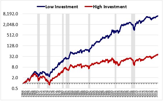
We refer to the hypothesis that investment is naturally inefficient as the “Inefficient Investment” hypothesis. It finds support in the inverse relationship that exists between investment propensity and returns in individual stocks. As the chart below shows, companies that invest heavily (i.e., “empire builders”) tend to dramatically underperform companies that invest lightly. For equal-weighted quintiles, the return difference comes out to more than 10% per year over the 1964 to 2018 period, a staggering difference:17
The hypothesis finds additional support in the market’s ongoing trend towards higher valuations. Over the last few decades, average market valuations have increased substantially relative to the past, causing the gap between prices and equity values to shrink to almost nothing. From 1871 through 1995, the market’s average P/IE ratio was 0.46, which means that corporate net investment traded, on average, at 46% of its par value. From 1995 to present, the market’s average P/IE ratio has increased to almost double that average, 0.85.
This shrinkage is reflected in a shrinking profitability gap. Over the last two decades, the gap has compressed down to almost nothing:
The fact that the profitability gap has come down markedly over time is evidence that it was the result of an inefficiency. Historically, public markets offered returns that were too high relative to the returns available on new investment. The market is now correcting that discrepancy--not by raising the returns on new investment, but by reducing the returns available in public markets.
Despite the increase in valuations seen in recent decades, corporate managers have shown a reduced propensity to invest and an increased propensity to repurchase equity through share buybacks and acquisitions. The chart below shows capital expenditures as a percentage of net income for U.S. Large Cap Stocks from 1972 through 2018:
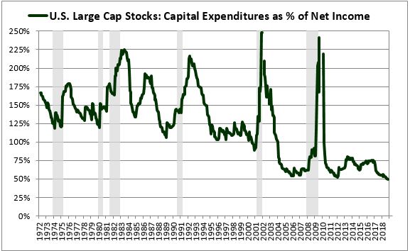
As you can see, capital expenditures have been in a clear downward trend. Advocates of the inefficient investment hypothesis can point to this downtrend as evidence that corporate managers are wizening up. They’ve developed an increased appreciation for the fact that investment tends to be a low-return proposition and are adjusting their capital allocation practices accordingly.
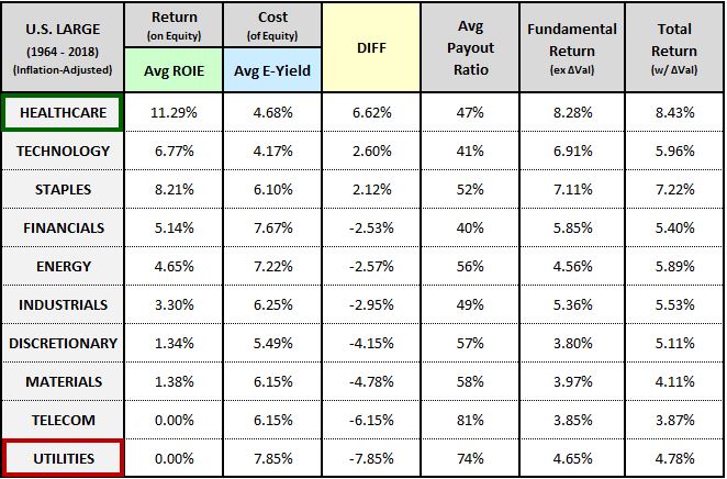
Interestingly, when we examine the profitability gap across different sectors, we encounter results that fit with our preconceptions. Sectors that we would expect to be prone to inefficient investment, such as the capital-intensive Utility sector, exhibit the largest profitability gaps. Conversely, sectors that we would expect to be highly efficient in their investments, such as the capital-light healthcare sector, exhibit no profitability gap at all, but instead, a profitability surplus:
To allow for further exploration of this topic, we present a slew of additional profitability data in Appendix E. Highlights include profitability data for 5 sectors going back to 1871, 28 industries going back to 1964, 10 countries going back to 1971, and a proxy for the popular buyback factor back going back to 1999.
It’s important to recognize that the “inefficiency” in the inefficient investment hypothesis is an inefficiency that’s detectable in hindsight, not necessarily in foresight, so it doesn’t necessarily imply a “mistake” on anyone’s part. People can only make decisions based on what they know in the present moment. From the perspective of the past, it may not have been possible to know that corporate investment would tend to deliver weak returns or that publicly traded securities were priced to deliver strong ones. Realistically, the only way to know that there’s a discrepancy between these modes of allocation is to see the discrepancy play out over an extended period. Having now seen it, today’s investors and corporate managers are in a better position to capitalize on it.
Reasons for Skepticism
We can tell a great story around the inefficient investment hypothesis, but we need to be careful with it. A 3.48% premium between the returns available from the purchase of existing assets and the returns available from the creation of new assets is an enormous premium, especially when compounded over 147 years. The sustained existence of such a premium for such a long period of time would represent a market failure of epic proportions.
It turns out that we can explain the profitability gap in a much more parsimonious way by questioning the earnings numbers that the corporate sector is reporting to us. As we will see in the next section, we have strong reasons to believe that those numbers are overstated. The overstatement explains the profitability gap almost perfectly.
Section 4: The Overstated Earnings Hypothesis
The profitability gap emerges because we take companies at their word. We trust that they’ve been earning what they say they’ve been earning. When we calculate the ROIEs and earnings yields associated with their earnings, we discover a gap.
But what if companies have actually been earning less than what they say they’ve been earning? What if they’ve been overstating their earnings? Let’s think about how that would affect the numbers.
If earnings were overstated, then the earnings yield, which is calculated from reported earnings, would appear to be higher than it actually is. The calculated 7.33% average would be an exaggeration.
Similarly, if earnings were overstated, then total retained earnings, which are calculated as total past earnings minus total past dividends, would appear to be higher than they actually are. The companies would therefore appear to have invested more than they actually did invest. The methodology would hold them accountable for the additional investment that never took place, causing their measured ROIEs to appear lower than they actually are. The calculated 3.85% average would therefore understate their profitability—that is, the profitability of the true investments that they actually did make.
The logic here can be difficult to visualize, so I spell it out in the equations below:
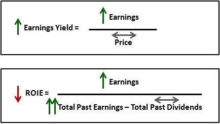
Earnings overstatement causes calculated earnings yields to wrongly go up because it causes reported earnings to wrongly go up. Conversely, it causes calculated ROIEs to wrongly go down because it causes total reported past earnings, which feed into the total calculated amount of past investment, to wrongly go up by more than the reported earnings themselves.
The overstatement therefore causes the cost of equity to wrongly rise and the return on equity to wrongly fall. The result ends up being an illusory profitability gap. The return on equity appears to be lower than the cost of equity, even when they’re actually equal to each other, because the return on equity gets understated and the cost of equity gets exaggerated.
We refer to the hypothesis that corporate earnings are systematically overstated as the “overstated earnings” hypothesis. Its chief proponent is the British economist Andrew Smithers.18 If true, the hypothesis would suggest that there is no actual profitability gap—the apparent gap is a mirage, an illusion brought on by inaccurate earnings reporting.
If you’re like most people, then your initial reaction to the hypothesis is probably to think that it’s outlandish. How could it possibly be true that companies have overstated their earnings for so long without anyone finding out? A fair question indeed, but I would urge you to give the explanation a chance. As we look into it further, we will encounter overwhelming evidence in its favor.
Depreciation: Uncertainties and Inaccuracies
The accounting item that is most likely to give rise to an overstatement of earnings is depreciation. Depreciation, defined as the reduction in the economic value of assets due to aging, wear and tear, and obsolescence, is a substantial expense for most businesses. Unfortunately, it’s a very difficult expense to accurately quantify (see Appendix A: Claim #5).
For an illustration of the uncertainty inherent in depreciation accounting, suppose that a company builds a new factory. When the company goes to calculate its earnings, it's not going to deduct the cost of the factory all in one period. Rather, it's going to deduct the cost incrementally in the form of depreciation charges applied over the factory's useful life. Crucially, the factory's useful life includes not only its physical lifespan, but also its lifespan as a competitive corporate asset, a state-of-the-art structure that can compete with current technology in the generation of output. Unfortunately, we don't really know what the factory's useful life will be in this broader sense. We have to use accounting thumbrules to make an educated guess.
Suppose that the cost of the factory is $100MM, and that the company estimates (guesses?) the factory's useful life to be 20 years. If the company assigns a salvage value of $20MM to the factory, then on the straight-line method, the factory's annual depreciation expense will come out to $4MM per year (= ($100MM - $20MM) / 20). But now suppose that the technology that the factory utilizes becomes obsolete more quickly than expected, and that its true useful life as a competitive corporate asset ends up being only 10 years. What's going to happen?
Eventually, the company will find itself in a situation where it has to spend large amounts of money on upgrades and improvements to maintain the factory's profitability. The company isn't going to treat these upgrades as direct expenses. Since the upgrades extend the factory's useful life, it's going to "capitalize" them, add them to the balance sheet as investments. The reason it's allowed to do that is that the costs associated with reversing declines in the factory's competitiveness over time are already being counted in the depreciation charges that the company is incurring each year. There's no need to count those costs twice. The problem, however, is that the costs aren't being counted correctly. Consequently, the company's true cost of doing business through the factory will end up being understated, causing an overstatement in its earnings. Given the uncertainty and complexity inherent in any business enterprise, it's easy to see how a company's true earnings could be misreported in this way, even in the absence of deceptive intentions.
What we're doing in the integrated equity exercise is holding the corporate sector accountable for its claimed investment history. We're saying to corporate executives, "Look, you claimed to have retained and reinvested some amount of money over your history. Where did that money go? Why is it generating such a low rate of return?" If, as a historical matter, corporations have been understating their true depreciation costs, then we know the likely answer. A sizeable portion of the retained earnings that corporations claim to have invested into growth would have actually gone into what's sometimes called "maintenance capex", capital expenditures that simply reverse the effects of depreciation (in this case, effects that are not being reported correctly). There's no growth in that capex--it simply fends off a decline--which would explain why it has failed to generate a market-competitive rate of return.19
Narrowing the Explanation: Distortions Associated with Historical Cost Accounting
To be fair, we don’t know how often the useful lives of assets get overestimated in the way described above. Consequently, we don’t know how often depreciation gets understated. It’s entirely possible that the useful lives of assets could get overestimated just as often as they get underestimated, producing errors in depreciation that cancel each other out in the aggregate. But even if depreciation errors cancel each other out, reported earnings will still contain a major depreciation-related inaccuracy. This inaccuracy is associated with a topic discussed in an earlier section, historical cost accounting. When used in the presence of inflation, historical cost accounting causes depreciation to be systematically understated, even when the useful lives of assets are estimated correctly.
As explained earlier, depreciation cannot actually be measured empirically. It can only be estimated using theoretical accounting methods. In a historical cost accounting framework, those methods are referenced to the historical cost of the asset. The depreciation is calculated as a function of that cost, with a certain amount of the cost deducted from earnings in each period as an expense. As we saw in earlier sections, inflation causes the historical costs of assets to be understated relative to true costs in current dollars. It therefore causes depreciation to be understated. Since depreciation is an expense, the result ends up being an overstatement of earnings.
For an illustration of the earnings distortion that inflation can introduce, suppose that Caterpillar builds a large production factory in 1965 at a cost of $10MM. Suppose further that the company depreciates the factory using the straight-line method down to a salvage value of $2MM over a 20 year useful life. Assume further that this useful life is correct--in the absence of additional investments, the factory really will last for 20 years before it becomes inoperable, obsolete, or otherwise uneconomic. Per the schedule, the company would then deduct $400,000 from its revenues each year as a non-cash expense. This amount is meant to approximate the cost of keeping the production factory in its current state of competitiveness as time passes. But now fast-forward to 1983. The CPI will have increased by a factor of roughly 3 times. The current-dollar cost of keeping the factory in its current state of competitiveness will likely be much higher than the nominal $400,000 being charged in depreciation each year. The company's reported earnings will therefore overstate the actual distributable cash flow leftover after the factory's true expenses have been paid.
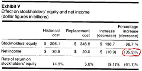
Because inflation over the last two decades has been very low, it’s not a pressing concern for investors or for the accounting profession. But it wasn’t always as low as it is today. The decade of the 1970s saw severe inflation, and the effects of that inflation showed up in financial statements. In 1977, Harvard Business Review shared the results of a review of required replacement cost disclosures of the 100 largest U.S. companies at the time. The results revealed that earnings numbers measured using a replacement cost framework were 35% lower than officially reported GAAP earnings numbers, reflecting an overstatement of 50%:
The overstatement in question, then, is not a negligible effect that we can just ignore. It matters.
Quantifying the Average Degree of Earnings Overstatement Across History
It turns out that we can quantify the S&P 500’s average degree of historical earnings overstatement by artificially shrinking the index’s actual historical earnings until an appropriate match is obtained between the index’s average cost of equity and its average return on equity. The table below shows the values that these variables take on under different levels of earnings shrinkage:
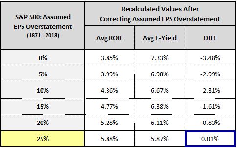
To construct the table, we go back in time and reduce the index’s earnings in each month to undo postulated overstatements of 0%, 5%, 10%, 15%, and so on, recalculating the index’s average ROIE and average earnings yield under the reduced earnings. We then select the degree of overstatement that minimizes the difference between these averages.
In the end, the optimal assumed degree of overstatement comes out to 25%. When we shrink the index’s earnings to undo that degree of overstatement, we get an average return on equity that matches the average cost of equity over market history, consistent with economic theory.
Corroborating the Overstated Earnings Hypothesis through Simulation
In Appendix F, we share the results of an accounting simulation that offers a powerful corroboration of the overstated earnings hypothesis. We start the simulation by building a perfectly efficient hypothetical index intended to mimic the S&P 500 in its average parameters (fundamental rate of return, interest rate, debt-to-equity ratio, depreciation rate, payout ratio, etc.). By stipulation, this index always trades at a true price-to-equity ratio of 1.0, with a cost of equity that’s always equal to its return on equity.
After building the hypothetical index, we allow it to generate earnings in an inflation-free environment. When we calculate relevant metrics for the index at equilibrium, all of the metrics come out as expected, with no profitability gap. We then add inflation to the simulation and recalculate the same metrics using historical cost accounting rules. The metrics become distorted, leading to an illusory profitability gap that isn’t actually real. Interestingly, the size of the illusory profitability gap ends up closely matching the size of the actual profitability gap seen in the actual S&P 500.
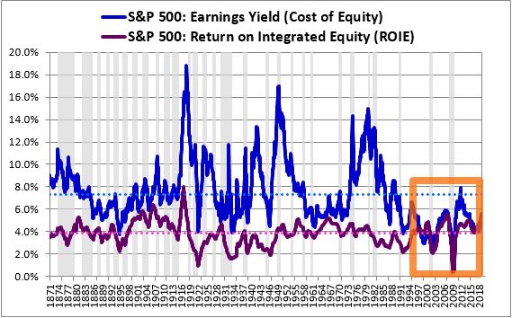
Ultimately, the illusory profitability gap arises from an inflation-related understatement of the index’s assets, which leads to an understatement of the index’s depreciation expenses. This understatement causes the earnings of the index to become overstated, which causes the index’s reported earnings yield and calculated ROIE, which each start out at a true value of around 5.5%, to take on the following distortions over time:
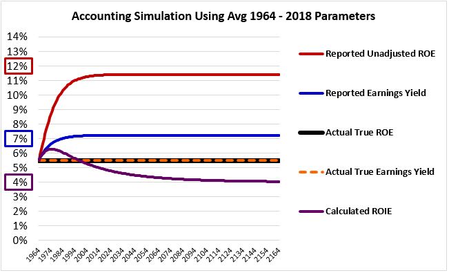
Look carefully at the calculated numbers in the chart above—7% for the reported earnings yield, 4% for the calculated ROIE, and 12% for the reported unadjusted ROE. We’ve seen these numbers throughout the piece—they’re the same average numbers calculated for the actual S&P 500:
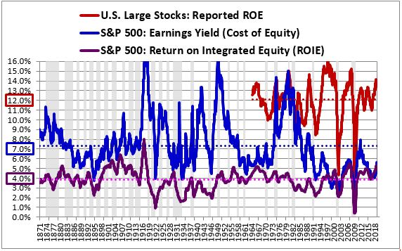
For a better visualization of the similarities, the chart below shows the results of the simulation alongside the actual data for the S&P 500. As you can see, the simulation equilibrates at the same values that the actual index averages out to over time:
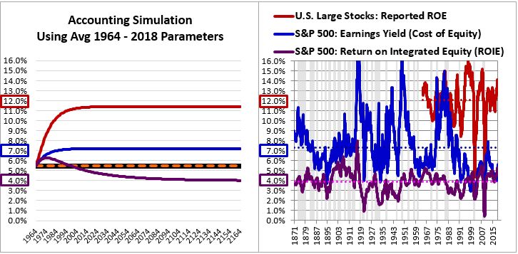
The fact that the S&P 500’s profitability gap can be almost exactly reproduced in an accounting simulation as the illusory consequence of an inflation-related overstatement in earnings is strong evidence in favor of the overstated earnings hypothesis. Some form of earnings overstatement is almost certain to have taken place in the index over the course of history. The only real question is how severe that overstatement has been, and how much of the profitability gap it explains.
After presenting and discussing the simulation, we use it to build a mapping between inflation rates and varying degrees of earnings overstatement. The mapping is shown below:
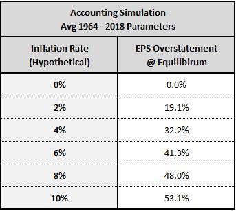
Applying the 2.07% inflation rate observed over the fully course of market history, the mapping estimates an average historical degree of earnings overstatement of approximately 20%, not far from the 25% that we estimated by a different method in the previous subsection.
A more extensive discussion of the simulation, with links to a spreadsheet that contains the actual numbers, is provided in the following appendix:
Historical Response to Inflation: SEC and FASB
The insight that inflation causes earnings to be overstated is not a new insight. The accounting industry has known about it and debated the proper response to it for many decades, going all the way back to the late 1940s, when inflation first started to receive attention as a public problem in the United States. It’s reasonable to therefore wonder why the SEC or the Federal Accounting Standards Board (FASB) haven’t ever mandated practices to correct for it.
The answer is that when inflation was at its peak in the United States, these bodies did mandate practices to correct for it. In 1976, the SEC published ASR 190, which required large companies to disclose what their financial numbers would have come out to under a replacement cost framework. FASB followed up in 1979 with the now superceded FAS 33, which required a similar disclosure. You can see an example of this disclosure in Walmart’s annual report for 1981:
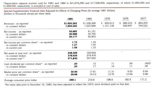
Notice that when a current cost framework is substituted for a historical cost framework in Walmart’s accounting, the company’s EPS drops and its book value rises, as expected. But these adjusted numbers are not the numbers that show up when an academic or a quant queries for “Walmart 1981 EPS.” ASR 190 and FAS 33 only required the numbers to be presented as supplements—they were never treated as “official” numbers. Consequently, they don’t show up in any of the historical data sources that today’s investors and researchers use.
Section 5: Implications for Individual Stock Selection and Overall Stock Market Valuation
The overstated earnings hypothesis carries significant implications for individual stock selection and overall stock market valuation. In this section, I’m going to examine factor-based techniques borrowed from OSAM that investors can implement to take advantage of its effects. I’m then going to use the hypothesis to explain why inflation affects valuations, and why the current U.S. stock market may be cheaper relative to the past than it appears to be.
Individual Stock Selection: The Value of Free-Cash-Flow
The overstated earnings hypothesis calls into question the very way in which we measure “value.” We normally use earnings to measure value, but earnings come with a large black box inside them—the black box of depreciation. Under GAAP rules, this black box gets filled in with an untested, unverified, and often arbitrary theoretical placeholder. What is the useful life of an asset? What is the annual cost of preserving its earnings power in the presence of deterioration, wear and tear, obsolescence, evolving market conditions, and so on? We don’t know. All we can do is make educated guesses. These guesses often turn out wrong, evidenced by the profitability gap that we see in the data.
Even if we assume that corporate managers are accurate, on average, in estimating the useful lives of their assets, we know that their depreciation expenses will be wrongly stated in at least one respect: those expenses are calculated based on asset values that are understated at historical cost. The expenses themselves therefore end up being understated, causing earnings to be overstated.
What we don’t know is the distribution of this overstatement across the market. If the overstatement is distributed more-or-less evenly across stocks, then it may not effect the stock selection process. But if the overstatement is distributed in an uneven way, it’s going to fool valuation metrics into thinking that stocks with understated depreciation are cheap when they aren’t, giving rise to adverse selection.
A better way to account for depreciation would be to track it not through arbitrary company guesses, but through its actual effects, by tracking actual capital expenditures themselves. That’s what “free cash flow” attempts to do. It adds depreciation back to earnings, and then subtracts capex. Because it’s tied to actual empirical flows, it’s less likely to understate (or overstate) a company’s true depreciation expenses.
The concern with free-cash-flow is that it treats all capex as maintenance capex, an expense that gets deducted from the result. It therefore penalizes companies that are engaged in genuine growth capex, causing their cost structures to appear larger than they actually are. But if, as the inefficient investment hypothesis asserts, corporate investment tends to produce low returns by its very nature, then penalizing growth capex may not be such a bad thing. The penalty is partially justified in light of the different risk that’s being introduced, the risk of inefficient investment.
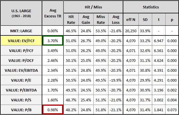
In the table below, we test free-cash-flow against other fundamental measures of value. We identify stocks that fell into the cheapest quintile of the U.S. Large Cap Stock Universe on different valuation metrics in each month from 1963 through 2018. We then calculate the arithmetic average of all of their subsequent one-year excess returns over the market.20 We only include stocks that have data for all of the metrics, therefore we exclude financials and utilities21:
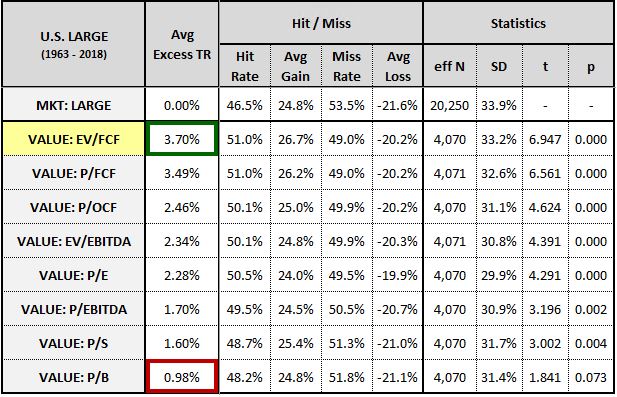
Out of all the metrics, enterprise-value-to-free-cash-flow (EV/FCF) generates the highest returns, with price-to-free-cash-flow (P/FCF) in close second. Both metrics produce excess returns that are a full percentage point higher than the next best metric, price-to-operating-cash-flow (P/OCF), which doesn’t subtract capex. The lowest ranking metric of all is the price-to-book ratio, with excess returns that fail to meet the 0.05 threshold for statistical significance.
The chart below shows the average historical sector exposures for the different metrics in the test:
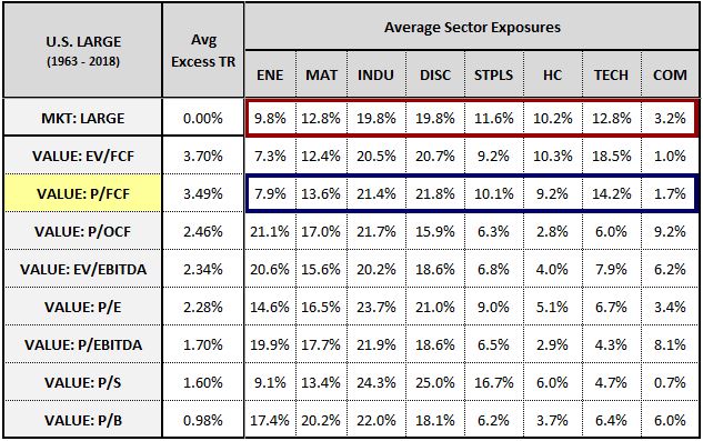
As you can see, P/FCF has no strong overweight in any sector, and is roughly equal-weighted, on average, to the top performing healthcare, staples and technology sectors. The metric’s outperformance, then, cannot be dismissed as a sector-related phenomenon.
Unsurprisingly, the income-based measures that completely ignore depreciation—P/OCF, enterprise-value-to-ebitda (EV/EBITDA) and price-to-ebitda (P/EBITDA) end up taking overweighted positions in the depreciation-heavy energy and materials sectors. They highlight the risk of ignoring specific types of expenses in the measurement of value—the value bet turns into a bet on sectors that happen to have larger exposures to those types of expenses.
In the chart below, we perform the same test on the small and mid cap stock universe:
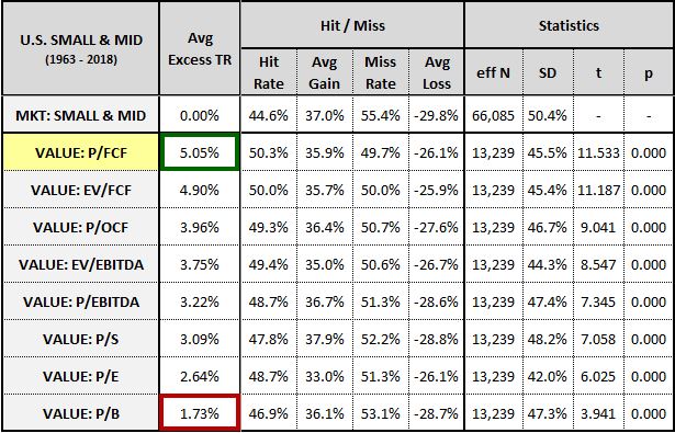
Again, the free-cash-flow metrics finish at the top of the list. All of the metrics outperform to the statistically significant 0.05 threshold. Interestingly, the P/E ratio declines in its relative performance, finishing below the price-to-sales (P/S) ratio. Its underperformance likely results from the fact that earnings tend to be more erratic and unreliable in smaller companies.
The chart below shows the average sector exposures for the factors in the small and mid cap test:
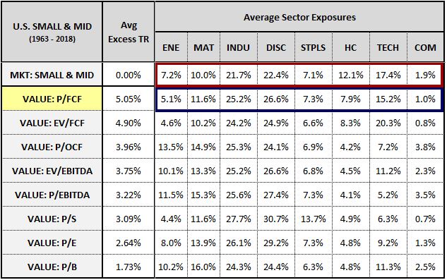
The P/FCF metric outperforms despite underweighting the top-performing healthcare and technology sectors, again confirming that the outperformance is unrelated to sector exposure.
Given these results, we might think that the optimal stock selection approach would be to abandon other measures of valuation and use free-cash-flow exclusively. The problem with this approach, however, is that it loses the risk-reduction benefits of diversification. Like all value metrics, free-cash-flow has experienced significant volatility in its historical performance. We don’t know for certain what it’s future performance will be. It therefore makes sense for us to diversify our value exposure, provided that we have other well-tested metrics that we can diversify into.
As a rule, any time a valuation metric is used to select stocks, the metric is going to inadvertently select stocks whose fundamentals happen to be exaggerated on that metric. The market will recognize the true value of the overstated company and will price it correctly, but the metric will wrongly think that the company is cheap, pulling it into the portfolio. Free-cash-flow is no exception here—using it as a metric in a value portfolio will inevitably bring certain companies into the portfolio whose free-cash-flows happen to be inflated by unusual items. These “fake” value companies will dilute the portfolio’s value exposure, exposing it to beta, or to something worse. If, instead of placing our bets on a single metric, we use a diverse array of well-tested metrics in conjunction with each other, we can mitigate this unwanted effect. The different metrics will cover each other’s blind spots, strengthening the overall value signal.
The table below illustrates the effects of this strengthening. The “AVERAGE: 8 METRICS” row shows the average of the individual top quintile excess returns of the eight metrics analyzed above. The “COMPOSITE (12.5%)” row shows the top quintile excess return of a composite metric that effectively blends the eight metrics together, assigning a 12.5% weight to its score on each of them:
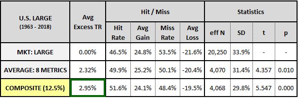
As you can see, the composite metric generates a higher return than the average of the individual returns of the metrics that it’s composed from. Figuratively speaking, the whole ends up being greater than the sum of its parts.
In the chart below, we separate the performances of the different valuation metrics into discrete time periods within the 1963 to 2018 period:
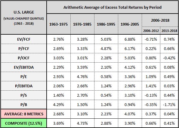
Though the free-cash-flow measures perform better in an absolute sense, their outperformance is inconsistent. The composite measure is able to smooth out some of that inconsistency while maintaining attractive overall returns. The fact that it manages to deliver absolute returns that are stronger than the free-cash-flow metrics in half of the periods analyzed is a testament to the concept behind it. It successfully generates those returns from a collection of statistically inferior factors.
Free-Cash-Flow in Profitability Metrics
In addition to performing well in valuation metrics, free-cash-flow also performs well in profitability metrics. The table below shows the performance of the top quintile of U.S. Large Cap Stocks on four profitability metrics: free-cash-flow-to-book value (FCF/B), free-cash-flow-to-invested-capital (FCF/IC), conventional ROE (E/B) and conventional ROIC (E/IC):
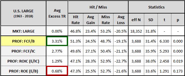
As you can see, the free-cash-flow-based measures outperform the earnings-based measures by a wide margin.
Overstated Earnings and the DepCap Ratio
Outside of value and profitability, a simple OSAM metric that investors can use to flag companies at risk of overstated earnings is the ratio of depreciation to capex. Companies that exhibit low values of this ratio are more likely to be understating their depreciation, covering for the understatement by engaging in large relative amounts of capex.
In the table below, we show the performance of the top and bottom depreciation-to-capex (DepCap) quintiles of the U.S. Large Cap Stock Universe from 1963 through 2018:
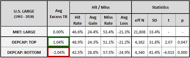
The return spread between top and bottom DepCap quintiles comes in at roughly 3%—a respectable spread, especially considering that the metric doesn’t directly tap into any value or profitability signals.
Like many factors, the DepCap ratio is more effective at identifying weak companies than strong ones. The implication is that an increased risk of earnings overstatement is more harmful to returns than a decreased risk is helpful.
Overstated Earnings and Stock Market Valuation: The Relevance of Inflation
Our natural reaction to the overstated earnings hypothesis is to view it as bad news for the stock market. All this time, we’ve operated under the assumption that companies in the market were earning a certain amount of money. When we find out that the amount has been systematically exaggerated, we come to wonder whether the market merits its current price, whether it’s overvalued.
But valuation is about relative comparisons. The implications that the overstated earnings hypothesis carries for the current market’s valuation will therefore depend on the relative severity of the overstatement across different periods of history. If earnings overstatements occurred to a greater extent in the past than they do today, then the current market’s relative valuation would be more attractive than we thought. The hypothesis would then be good news for the current market, not bad news.
To work out the implications of the overstated earnings hypothesis, let’s look back and examine the cheapest recorded periods of U.S. market history outside of the two major banking panics. First, we have the post-WW1 period in the late 1910s and early 1920s. Second, we have the post-WW2 period in the late 1940s and early 1950s. Third, we have the mid-1970s through the early 1980s. What do each these periods have in common? The answer: high levels of inflation.
Historically, high levels of inflation have been strongly associated with depressed valuations. There are two popular explanations for the association:
- Interest Rates: High levels of inflation leads to high interest rates, which imply high discount rates and therefore low valuations.
- Economic Damage: High levels of inflation depress investor sentiment by introducing uncertainty into the economy and impeding economic growth.
The problem with the first explanation, interest rates, is that in addition to causing high interest rates, high inflation causes high nominal growth, which warrants high valuations. If there’s a variable that’s relevant to valuation, it’s the real interest rate, the interest rate relative to inflation. During the above inflationary periods, valuations remained depressed even when real interest rates were kept at very low levels, as they were, for example, in the late 1940s and the mid-1970s.
The problem with the second explanation, economic damage, is that the actual damage that the economy has experienced during inflationary periods hasn’t been all that significant, certainly not significant enough to justify the deep reductions in valuation that occurred during the periods. As an example, the U.S. economy experienced far less damage during the inflation of the 1970s than it did during the 2009 financial crisis and aftermath. Still, it was punished with a much lower multiple.
Despite these problems, both explanations are likely to be true in the sense that they’re believed to be true. The fact that investors believe the explanations to be true causes them to transact—buy and sell—in anticipation of their being true. These anticipatory transactions, in turn, give rise to correlations and outcomes that make the beliefs true, even when they aren’t fully true in the theoretical sense.
With all that said, if we’re looking for a genuinely compelling explanation for the relationship between inflation and valuation, we can find one in the overstated earnings hypothesis. In a historical cost accounting framework, high levels of inflation mean high levels of understated depreciation and therefore high levels of earnings overstatement. If the market, in its wisdom, is able to detect this overstatement, then we should expect it to assign lower multiples to the earnings. When we look back at inflationary periods in market history, that’s exactly what we see happen.
Interestingly, the overstated earnings hypothesis vindicates the often-mocked “Rule of 18.” The “Rule of 18” tells us that if the sum of the Dow’s P/E ratio and the inflation rate is higher than 18, then stocks are going to fall. The actual number in the rule, 18, may not have a clear basis in anything, but the directionality of the rule is consistent with the accounting effect that inflation has on earnings. High levels of inflation mean that earnings are overstated and that the market deserves a lower multiple.
The overstated earnings hypothesis is therefore bullish for the current market. The inflation rate today is much lower than it was in the past, which means that current earnings are less overstated and that current multiples deserve to be higher. When we compare current multiples to past averages, the current market looks expensive—but those past averages are associated with different inflationary conditions, invalidating the comparison.
Using Free-Cash-Flow to Empirically Measure Earnings Overstatement
We can measure the degree of earnings overstatement that has taken place across different periods of history by comparing free-cash-flow to earnings. Instead of capturing depreciation through the use of accounting thumbrules, free-cash-flow captures depreciation by tracking actual empirical capex flows. Consequently, it provides a more accurate picture of the actual distributable earnings that companies are generating, particularly during inflationary periods.
We don’t have free-cash-flow data for the post-WW1 and post-WW2 inflations, but we do have that data for the inflation of the 1970s and 1980s. In the chart below, we show the ratio of free-cash-flow (per share) to EPS for large cap stocks from 1973 through 2018. Crucially, we only include stocks that we have free-cash-flow data on—all other stocks are excluded:
The chart confirms our suspicions. Earnings during the inflation of the 1970s and 1980s appear to be significantly overstated, coinciding with very low levels of free-cash-flow. Earnings during the recent period, in contrast, appear to be significantly understated, coinciding with very high levels of free-cash-flow.
Using data from the Flow of Funds (Z.1, B.103), we can directly tie the free-cash-flow content of EPS to the difference between the historical cost value of the corporate sector’s assets and the replacement cost value of those assets. Across history, whenever corporate asset values were excessively understated at historical cost, free cash flow was noticeably lower as a percentage of EPS, suggesting an inflation-related understatement in depreciation, exactly as we would expect:
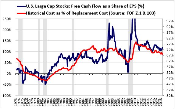
Though falling inflation is a relevant factor in the recent increase in free cash flow as a share of earnings, it's not the only factor, and it may not even be the most impactful. Additional potential factors include:
- Changes in Accounting Standards - The incorporation of increasingly harsh accounting standards related to the treatment of potentially impaired assets and the expensing of research and development outlays have likely reduced the overstatement of earnings relative to the past, particularly in high-technology sectors.
- Structural Change - Though speculative, it's possible that structural changes in the economy have led to increases in the effective useful lives of the corporate sector's assets, reducing the corporate sector's true depreciation expense. Recall that the useful life of an asset depends on how quickly it becomes obsolete in the face of competition from technological improvements. If the overall pace of technological improvement in the economy is slower today than in the past, or if the channels for competition between corporations are weaker, then we should expect the corporate sector's assets to retain their economic value for longer periods of time. This would extend their useful lives and reduce the true depreciation expenses associated with them.
Regardless of the actual causes of the change, if today’s earnings are less overstated than the earnings of the past, then today’s market deserves a higher multiple.22
In conclusion, the overstated earnings hypothesis is bullish for the market, not bearish. It doesn’t give us license to take valuations to extremes, but it does give us a sound basis for taking them higher than the averages of past eras. Of course, we’ve already taken them higher than those averages, so our work in that area is already done.
What the hypothesis does invalidate, however, is the notion, endorsed by some investors, that the market’s earnings yield can reliably forecast its future return. This notion is already refuted by the fact that earnings fluctuate across economic cycles. But even if earnings didn’t fluctuate, the market’s earnings yield would still be unreliable as a predictor of its future return, because the reported earnings used to calculate the earnings yield are systematically overstated relative to reality.
Section 6: Using the Integrated Equity Methodology to Value Markets and Individual Stocks
In this final section of the piece, I’m going to show how the integrated equity methodology can be used to construct a stock market valuation metric that outperforms other popular metrics.
Price-to-Integrated Equity: The P/IE Ratio
In an earlier section, we examined a chart of the ratio between the S&P 500’s price and its calculated integrated equity from January 1871 through December 2018. Here’s that chart again:

The ratio shown in the chart is a bona fide valuation metric. It measures the real price of the market relative to the real amount of money that has historically been put into it. We refer to it as the price-to-integrated equity ratio, or the “P/IE” ratio for short.
If we normalize the metric to its historic average, we find that it tracks very closely with the popular Shiller CAPE ratio. The chart below shows the two normalized measures alongside each other, with the end date increased to March 2019:
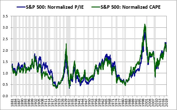
It’s worth pausing to appreciate the elegance of the relationship between these two metrics. The metrics are tightly correlated because there’s a close relationship between net investment and earnings. When measured in a properly inflation-adjusted manner, the cumulative net investment per share of the index tracks with its smoothed average real earnings per share:
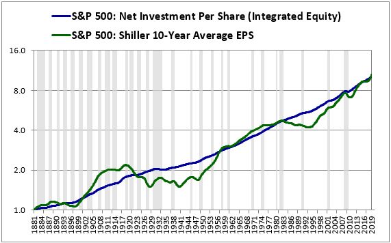
Notice the difference in the smoothness of the blue line and the smoothness of the green line. The blue line, which represents the integrated equity term used in the denominator of the P/IE ratio, stays locked on its long-term trend. The green line, which represents the Shiller 10-year average earnings term used in the denominator of the CAPE ratio, oscillates arbitrarily around that trend depending on where in the various long-term profit cycles the 10-year averaging period happens to land. The difference between the two lines highlights a key advantage that the P/IE ratio has over the “cyclically-adjusted” P/E ratio: it’s even less cyclical.
As a valuation metric, the P/IE ratio is similar to the price-to-book ratio and the Q-ratio. It’s different from the price-to-book ratio in that it’s constructed from consistent, inflation-adjusted prices. It’s different from the Q-ratio in that it’s based on a historical cost measurement of equity rather than a hybrid measurement that sometimes utilizes replacement cost techniques.
The practical advantage that the P/IE ratio has over both of these competing metrics is that it’s readily calculable on a daily basis. Historical book value data for the broad U.S. equity market is expensive to obtain and is therefore inaccessible to many retail investors. Q-ratio data can only be obtained from the Flow of Funds report, which is published with a three month lag. Integrated equity data, in contrast, can be easily calculated in real time from the data shared on S&P’s website and in Robert Shiller’s spreadsheet.
Testing the Performance of the P/IE Ratio
A better way to measure a valuation metric’s accuracy is to examine its correlation with actual subsequent future returns.23 That’s what we’re going to do in the next few subsections.
To begin the test, we show correlations between future S&P 500 10-year returns and the following metrics: the trailing-twelve-month (ttm) P/E ratio, the CAPE ratio, the total return (TR) CAPE ratio, which is an improvement designed to eliminate distortions associated with changing dividend payout ratios, and the P/IE ratio. We examine the correlations over dates ranging from January 1881, the first year of available CAPE data, through March 2019. Note that a more negative correlation indicates a stronger predictive relationship:
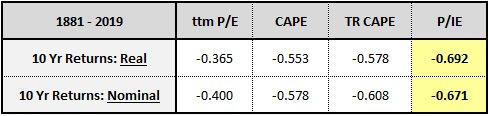
As you can see, the P/IE ratio outperforms all of the other metrics.
In the table below, we increase the start date of the test to January 1945:
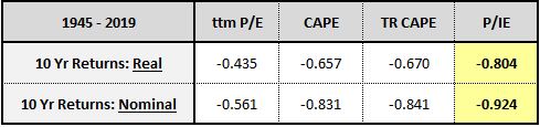
Again, the P/IE ratio outperforms all of the other metrics.
An interesting proposed improvement to the CAPE involves adjusting the trailing 10-year earnings average for cyclical fluctuations in profit margins. The performance of the resulting metric, which we refer to as the PM CAPE, is shown in the table below. The analysis begins in 1962, the earliest date for which reliable S&P 500 profit margin data is available:
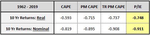
The margin is smaller, but the P/IE ratio again outperforms all of the metrics. Unlike the PM and TR PM CAPEs, it does so without the luxury of a post-hoc modification.
The table below shows the P/IE ratio’s performance against the Q-ratio. The test starts in 1952, the earliest date for which quarterly Q-ratio data is available:
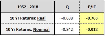
Again, the P/IE ratio outperforms.
Finally, we show the P/IE ratio’s performance in the OSAM U.S. Large Cap Stock universe alongside the price-to-ebitda ratio, the price-to-book ratio, the price-to-sales ratio:
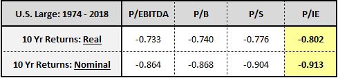
Again, the P/IE ratio outperforms all of the metrics. The margin of its outperformance isn’t always large, but the consistency merits respect.
Estimating Future 10-Year Returns
The chart below shows the normalized P/IE ratio of the S&P 500 alongside its subsequent future 10-year nominal total returns (right axis, inverted) from January 1952 through March 2019. The correlation comes in at an exceptionally strong 0.916:
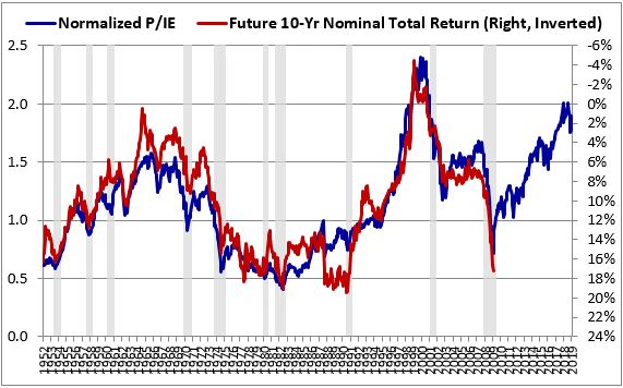
If you look closely at recent decades in the chart, you’ll notice that the P/IE ratio has been consistently underpredicting returns. We can locate a possible explanation for this underprediction in accounting changes discussed earlier in the piece. As we saw in the free-cash-flow to EPS chart, the introduction of asymmetric accounting standards over the last two decades has caused reported GAAP earnings to become understated relative to the past. We used those earnings in the integrated equity methodology to calculate retained earnings. The understatement therefore passes through to our P/IE metric, pushing up on it in a way that overstates the market’s current relative expensiveness and that impairs the metric’s current predictive power.
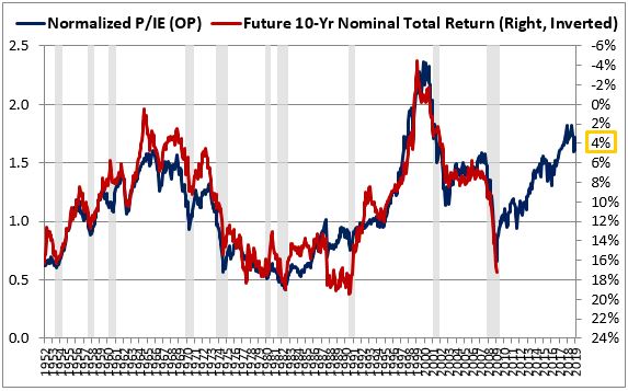
If we’re willing to trust ourselves with a post-hoc adjustment, we can calculate the P/IE ratio using S&P’s published operating earnings series in place of reported GAAP earnings. If we do that, we will notably improve the accuracy of the metric’s recent predictions. The chart below shows the result:
The correlation rises to 0.926, driven by a clear narrowing of the gap seen over the last two decades. With the S&P 500 at 2830, the metric is currently predicting a future 10-year nominal return of between 3% and 4% per year. The metric is therefore telling us what every other popular metric has been telling us—stocks are historically expensive, priced for low future returns.
Acknowledging the Uncertainty
In the tests above, our choice to use a forecast horizon of 10 years was ultimately arbitrary—we cherry-picked that horizon because it produced the tightest overall fit. In the chart below, we show the performance of the P/IE measure from 1935 to 2018 on all future return horizons up to 30 years. The real return correlations are shown in dark colors (r) and the nominal return correlations are shown in light colors (n):
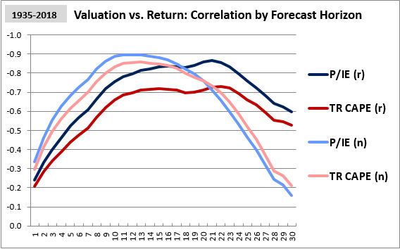
The nominal return correlations are exceptionally strong on 10-year horizons, but that strength drops off rapidly as the horizons are increased. The sharp drop-off increases the likelihood that the strength is spurious, the result of fragile historical coincidences rather than robust, recurring causal processes.
In contrast to the fragility of the nominal return correlations, the real return correlations are reasonably stable over the different forecast horizons. The relative improvement fits with theory—we expect valuations to correlate more robustly with real returns because those returns don’t have the varying and unpredictable noise of inflation built into them.
The metric’s correlation with real returns isn’t perfect, but we don’t want perfect in this context. Perfect would be a sign of overfitting, the post-hoc exploitation of fortuitous coincidences in a model. Since valuation metrics only have part of the information that determines future returns, we should only want them to be partially correct in their predictions—anything more than that would be unreliable.
The 3% to 4% estimate shown above should therefore be interpreted as a highly uncertain estimate. It could easily turn out to be wrong—and probably will turn out to be wrong. All that any valuation metric can deliver is a rough range of future return estimates. The estimated range in this case is: “lower than normal.”
Adjusting the P/IE Ratio for Earnings Overstatement
The P/IE ratio that we calculated for the S&P 500 above is technically incorrect. It was constructed from reported earnings that are systematically overstated. The retained earnings sum in its denominator exaggerates the true sum of retained earnings that the corporate sector has accumulated over its history, which is why the metric’s harmonic average over the period comes out to 0.50, as opposed to the 1.0 that we would expect in an efficient market. The reason the metric is able to accurately predict returns is that it adequately depicts the relative differences between valuations across periods, even though its absolute levels are consistently off.
To arrive at a better representation of the market’s historical valuation, we can shrink the S&P 500’s historical reported earnings to account for the degree of overstatement that we believe took place. In the previous section, we estimated that earnings across history were overstated by an average of approximately 25%. If we shrink reported earnings across history to undo that overstatement, and we then recalculate the metric, we will obtain the following result:
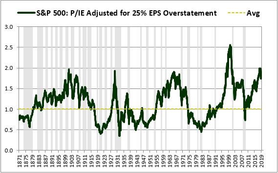
The metric’s harmonic average increases to roughly 1.0, precisely what we would expect it to be in an efficient market.
Interestingly, the effect of the earnings reduction on the metric is not uniform across periods.24 It benefits the current period on a relative basis:
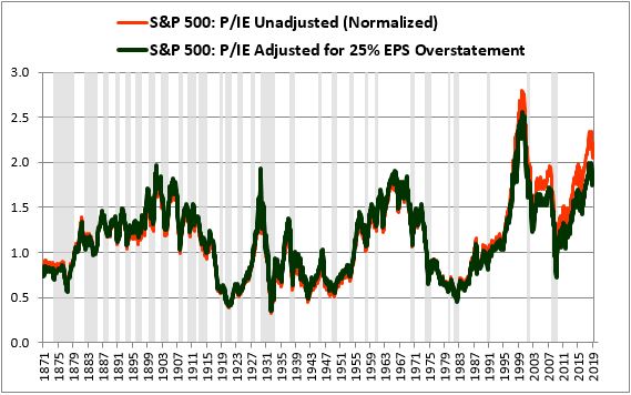
In the charts above, the adjustment was applied to reported GAAP earnings. If we shift to a measure that uses operating earnings, and apply the same adjustment, we get an exceptionally tight correlation with future nominal returns, 0.940. Projecting out the correlation, we end up with at an estimated future 10-year nominal return of just under 6%:
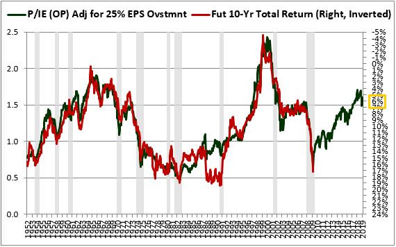
Much of the correlation strength observed in the chart above is likely attributable to coincidence. Still, the fact that we can push the methodology to greater levels of predictive accuracy by making improvements that we know are needed under the overstated earnings hypothesis counts as a point in its favor.
The chart below shows real return correlations for the unadjusted P/IE ratio and the P/IE ratio adjusted for 25% earnings overstatement:
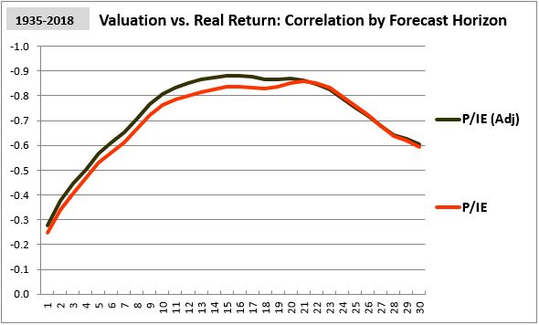
The downward adjustment to earnings produces a noticeable improvement across most of the tested horizons.
The P/IE Ratio in Individual Stocks
In 2018, OSAM’s Travis Fairchild wrote a highly persuasive critique of the price-to-book (P/B) ratio as a factor for selecting individual stocks. He identified three ways in which book value understates corporate assets: (1) by understating the value of intangibles, (2) by understating the value of long-term assets such as real estate, and (3) by punishing companies that deploy large amounts of income into share buybacks. The impact of these distortions is confirmed in the P/B ratio’s poor historical performance relative to other valuation measures.
As a factor for selecting individual stocks, can the P/IE ratio improve on the P/B ratio’s problems? It’s difficult to say, because most stocks don’t have a large enough history to allow for a proper measurement of initial equity value. However, if we’re willing to accept a possible reduction in performance, we can get around this problem by setting each company’s initial equity value equal to an inflation-adjusted multiple of its earliest reported book value.
In the table below, we share the results produced by this approach. We compute the integrated equity of every U.S. Large Cap stock using an initial equity value equal to twice the initial reported book value, scaled to current prices. We then calculate the average excess one-year returns of stocks in the cheapest (“value”) and most expensive (“glamour”) P/IE ratio quintiles. We show those returns alongside equivalent returns for stocks in the cheapest and most expensive P/B ratio quintiles25:
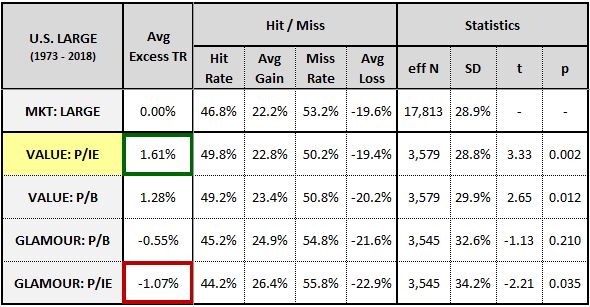
As you can see, the P/IE ratio beats the P/B ratio in identifying outperforming value stocks and underperforming glamour stocks. However, the effect isn’t very large.
The P/IE ratio’s inability to significantly outperform the P/B ratio shouldn’t come as a surprise. The ratio doesn’t fix the main problems that Travis identified in his piece. It does nothing to correct the understated value of intangibles such as R&D and brands, evidenced by the fact that it maintains the P/B ratio’s strong underweighting to the R&D-intensive technology and healthcare sectors, as well as the P/B ratio’s moderate underweighting to the brand-intensive consumer staples sector. These three sectors were the highest performing sectors in the market during the period:
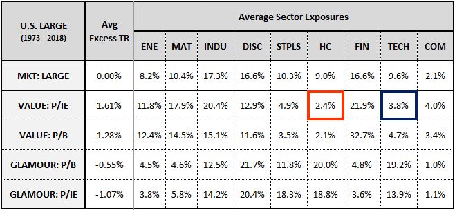
As for the understatement of long-term asset values, the P/IE ratio helps address the inflationary aspect of the understatement, but it doesn’t help with any of the other aspects that Travis discussed in his piece. Those other aspects are likely to introduce greater distortions into the selection process because they aren’t spread out across the index as uniformly as the effects of inflation are.
To its credit, the P/IE ratio does address one of the distortions that Travis highlighted, the distortion associated with share buybacks. But that distortion may not be as pervasive in its contribution to the P/B ratio’s woes as the other two distortions. At any rate, the P/IE ratio does offer some improvement over the P/B ratio. Improved accounting of share buybacks is likely to be part of the reason for that improvement.
The P/IE ratio’s mediocre performance in this context suggests that it’s not as accurate at measuring the value of individual stocks as it is at measuring the value of the overall stock market.26 It’s not alone in that respect—the CAPE ratio is also significantly less accurate when used to measure the value of individual stocks. CAPE enthusiasts are often surprised to see how poorly the CAPE ratio performs in the individual stock space, particularly in comparison with metrics such as the simple ttm P/E ratio that it easily beats in the overall market.
To illustrate the point, the table below shows the average excess returns of the cheapest quintiles of the Large Cap Stock Universe measured using the CAPE ratio and the simple ttm P/E ratio from 1973 to 201827:
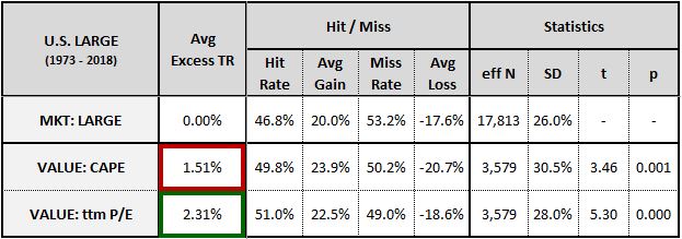
As you can see, the cheapest CAPE ratio quintile generates lower average returns than the cheapest ttm P/E ratio quintile. Surprisingly, the cyclical averaging, which is the CAPE’s primary selling point, makes its performance worse.
To understand why valuation metrics like the CAPE ratio, the P/IE ratio and the P/B ratio tend to produce lower-than-expected returns when used to select individual value stocks, we need to recall the mechanism through which the value factor works. As Chris Meredith, Patrick O’Shaughnessy and I explained in Factors from Scratch and Alpha Within Factors, the value factor works through a re-rating process. The process begins when the market develops an expectation that the fundamentals of certain companies will weaken going forward. It therefore prices those companies at a discount relative to their current fundamentals, turning them into “value stocks.” On average, the fundamentals of the value stocks actually do weaken, but they don’t weaken by as much as expected, and they eventually recover. The initial discount applied to them ends up being too large, forcing a subsequent re-rating that delivers excess returns to those who buy in at the beginning of the process.
Of course, not all value stocks follow this trajectory. Some value stocks turn out to be value traps whose fundamentals continue to deteriorate long after purchase, with no eventual recovery. The effectiveness of a value metric is determined, in part, by how well it can distinguish these value traps from the desirable value
stocks that are going to recover and deliver attractive returns. The results shown in the table suggest that the CAPE ratio, the P/IE ratio and the P/B ratio are not as effective as the ttm P/E ratio in making that distinction. This shouldn’t come as a surprise—the fact that they measure “value” using fundamentals from the distant past rather than the recent past makes them more likely to select structurally unprofitable businesses that are in long-term decline.
To illustrate the point with a familiar example, suppose that a brick-and-mortar movie rental company enters into long-term decline in the presence of heavy competition from a disruptive internet-based competitor. As the decline plays out and the stock price of the company falls, how will its CAPE, its P/IE ratio and its P/B ratio respond?
The company’s CAPE ratio is going to fall significantly, because its new lower share price will get divided by its average earnings over the last 10 years, which will be much stronger than its recent earnings. Its P/IE and P/B ratios will fall significantly because its new lower share price will get divided by integrated equity and book value terms that will be stuck at historical investment cost (unless and until major writedowns occur). The market will recognize that the equity of the company is impaired, unable to generate the rates of return that it used to generate. It will therefore price the equity at a large discount to par. All three of the measures will flag the company as “cheap,” drawing it into the portfolio and riding it down on its journey to zero.
The ttm P/E ratio is different from these measures in that it tracks a quantity that’s sensitive to recent fundamental performance. It focuses on the trailing-twelve-month earnings, which would not be strong for a given company if the company were in serious decline, and which will soon come to reflect any such decline that might begin. The distressed company in our example will have recent earnings that are deeply negative, eliminating any possibility that the ttm P/E ratio might mistakenly identify it as a worthwhile value stock.
The process of selecting value stocks involves a trade-off. On the one hand, we don’t want a hyper-sensitive, ultra-short-term metric that will rule out companies at the slightest sign of fundamental weakness. A metric of that type will get caught up in noise and will be unable to identify attractively priced companies whose challenges are only temporary. On the other hand, we don’t want a blind, sluggish, unresponsive metric that measures value based on what a company was doing 10, 20 or 30 years ago. A metric of that type will end up drawing in every soon-to-be-bankrupt value trap that exists in the market, because every such company is going to look cheap relative to what it was earning way back then. What we want is a valuation metric that can optimally navigate this tradeoff. The evidence suggests that the ttm P/E ratio does a better job of navigating it than the other metrics in the table.
When we analyze valuation at the broad market level, we’re engaged in a completely different exercise from the exercise above. We’re comparing the market to its own history, seeking to infer its likely future returns from the returns that it produced when it traded at similar valuations in the past. In this effort, we don’t have to worry about value traps. All of the good stocks in the market and all of the bad stocks are being aggregated together into a single index, where they cancel out and form a long-term fundamental trend. We want metrics that can accurately represent that trend and that can accurately depict where prices are relative to it. The ttm P/E ratio is poorly equipped for this task because it’s highly sensitive to short-term cyclical fluctuations. The P/IE ratio, the P/B ratio, and the CAPE ratio are better equipped because they neutralize those fluctuations, either by ignoring them altogether, or by averaging them out.
Appendices
Footnotes
1 A geometric average is calculated as the n-th root of n numbers multiplied by each other. An arithmetic average, which is the kind of average that we most often see and use, is calculated as the sum of n numbers divided by n.
2 Because earnings already reflect the subtracted expense of depreciation, i.e., the cost of reversing depreciation, we can conceptualize this capital as non-depreciating when comparing it to earnings over time.
3 We focus on real, inflation-adjusted returns here because ROE is a real quantity. Like the earnings yield, it's obtained by dividing one nominal number by another nominal number. Inflation cancels out of the ensuing expression, and therefore the expression should track with real returns.
4 The typical U.S. convention is to carry investments at gross historical cost in one account, and then subtract accumulated depreciation via a contra account.
5 For an excellent survey of the history of historical cost accounting in the United States, see "The SEC Rules Historical Cost Accounting: 1934 to the 1970s" by Stephen Zeff.
6 In recent decades, international financial reporting standards (IFRS) have become more liberal with respect to allowing replacement cost or "fair value" approaches to be used in specific circumstances, but these standards are still rooted in a historical cost framework.
7 The CPI tracks a weighted-basket of goods and services. For a transaction involving a specific good or service, the change in the CPI may not accurately reflect the change in the cost of that specific good or service. For changes in the CPI to accurately represent changes in costs, transactions need to be aggregated together in the context of large, economically-representative stock indexes.
8 These "net" investment numbers are net of depreciation, debt issuance, and divestments such as dividends and share buybacks. Admittedly, the depreciation portion of this netting is distorted by the fact that the depreciation expense is calculated from the historical cost of the investment, which is not adjusted for inflation. We will discuss this distortion when we examine the "overstated earnings" hypothesis.
9 Given the effects of inflation, companies tend to trade, on average, at prices that are higher than their reported book values per share. Consequently, buyback events tend to cause downward deviations in reported book values per share, with dilution events causing upward deviations. These deviations have the potential to significantly distort price-to-book ratios and ROE measures. A benefit to using the sum of retained EPS as a proxy for book value per share is that doing so eliminates such distortions, offering a more useful and meaningful representation of the total historical per share equity investment that shareholders have made in the companies.
10 The match between the lines is stronger in the earlier period of the chart for three reasons. First, the accounting standards used to calculate reported book value contained fewer one-time accounting items. Second, share buybacks were significantly less common. Third, the market's price-to-book ratio was closer to 1.0 during the period, reducing the impact of paid-in-capital.
11 Deviations between the measures are more pronounced in later periods of the chart because reported book values include the effects of one-time accounting items that are not always included in the earnings series that we use to calculate retained earnings. Over the last few decades, as the GAAP standard has increasingly departed from the traditional historical cost standard, the frequency of these items has increased. A useful benefit to the integrated equity methodology is that it removes the items from the measure, offering a better representation of the total historical cost investment that shareholders have made.
12 The reason that $BA's average P/B ratio in the table isn't as elevated as its average ROE is that the P/B average was calculated as a harmonic average. If it had been calculated as an arithmetic average, the recent explosion in the company's P/B ratio would have driven the average up to 7.30.
13 The chart includes data for the historical seed of the S&P 500 prior to its 1957 inception. The data were obtained from the Cowles Commission and S&P Corporation via Robert Shiller's website.
14 The fact that the inflation-unadjusted ROIE methodology can produce numbers that oscillate around the same 12% level as the reported ROEs (which were obtained from an entirely different data source) corroborates the accuracy of the "integrated equity" approach. The overlap in the chart proves that if a correct initial value can be specified, book value per share can be accurately represented as the total sum of retained earnings per share over time.
15 Bear in mind that this is just an estimate. There are stipulations that can make it more true, or less true.
16 Technically, the return from "corporate investment" that we're speaking of here includes a contribution from share buybacks. But it's only a small contribution, because buybacks were illegal for much of the period and have only recently become popular as a method of returning cash to (exiting) shareholders.
17 The chart shows the equal-weighted performance of U.S. stocks in the top and bottom quintiles of investment, with investment defined as the percentage change in assets over the prior year. The source for the data is Kenneth French's website. For more information on investment as a factor, see "A Five-Factor Asset Price Model" by Eugene Fama and Kenneth French.
18 In his 2009 book "Wall Street Revalued", Smithers pointed to the discrepancy between NIPA-based measures of U.S. Corporate ROE and average earnings yields for the S&P 500 as evidence that corporate earnings were overstated.
19 To be clear, not at all maintenance expenditures are capitalized. Some types of maintenance expenditures, e.g., replacing the oil in a car, have to be undertaken for the asset to have the useful life that we've assumed it to have. Such expenditures do not appreciably increase the remaining useful life of the asset, and so they're expensed in the period in which they occur. Other kinds of maintenance expenditures, e.g., overhauling a power plant, aren't necessary for the asset to have the useful life that we've assumed it to have. Such expenditures appreciably extend the remaining useful life of the asset, and so they're capitalized and depreciated, i.e., expensed incrementally in future periods.
20 This approach is arguably more accurate than the conventional approach of building an equal-weighted factor portfolio because it weights each stock in history equally. The conventional approach weights older stocks more heavily than newer stocks because it puts them into past portfolios that had a smaller total number of stocks, causing them to take on a greater relative weighting.
21 The effective sample size for each test ("eff N") is defined as the total number of non-overlapping monthly individual stock samples. The hit rate is the overall percentage of stocks that outperformed the market and the miss rate is the overall percentage that underperformed it. The average gain is the average gain on a hit and the average loss is the average loss on a miss.
22 If profit margins are set to mean-revert, then this logic will not hold. The fact that earnings are currently understated relative to the past will simply mean that true profit margins are even more elevated on a relative basis than we thought they were, implying an even greater drop on a move back to the historical average.
23 When we take the P/IE metric calculated above and test its correlation with subsequent future returns, we expose ourselves to a small amount of look-ahead bias. In Appendix G, I explain why this bias does not undermine the test.
24 The effect of the earnings reduction on the CAPE ratio, in contrast, is uniform.
25 To allow sufficient time for retained earnings to accumulate in the integrated equity calculation, we limit the analysis to companies that have data for both metrics going back at least 10 years.
26 Part of the reason for the difference lies in the different ways that inflation affects comparisons. Broad market valuation metrics attempt to compare a market's current valuation to its prior valuations. Inflation matters significantly to those comparisons because rates of inflation are different across different periods of time. The effect of Inflation on comparisons between stocks in the same period, however, is much less pronounced, because the stocks all live under the same inflationary conditions. The relative benefit of using an inflation-adjusted measure such as the P/IE ratio to choose between them isn't as large because the effect of inflation on them is more uniform.
27 The sample is limited to companies that have trading histories of at least ten years, the minimum amount of time needed to calculate a CAPE.
General Legal Disclosures & Hypothetical and/or Backtested Results Disclaimer
The material contained herein is intended as a general market commentary. Opinions expressed herein are solely those of O’Shaughnessy Asset Management, LLC and may differ from those of your broker or investment firm.
Please remember that past performance may not be indicative of future results. Different types of investments involve varying degrees of risk, and there can be no assurance that the future performance of any specific investment, investment strategy, or product (including the investments and/or investment strategies recommended or undertaken by O’Shaughnessy Asset Management, LLC), or any non-investment related content, made reference to directly or indirectly in this piece will be profitable, equal any corresponding indicated historical performance level(s), be suitable for your portfolio or individual situation, or prove successful. Due to various factors, including changing market conditions and/or applicable laws, the content may no longer be reflective of current opinions or positions. Moreover, you should not assume that any discussion or information contained in this piece serves as the receipt of, or as a substitute for, personalized investment advice from O’Shaughnessy Asset Management, LLC. Any individual account performance information reflects the reinvestment of dividends (to the extent applicable), and is net of applicable transaction fees, O’Shaughnessy Asset Management, LLC’s investment management fee (if debited directly from the account), and any other related account expenses. Account information has been compiled solely by O’Shaughnessy Asset Management, LLC, has not been independently verified, and does not reflect the impact of taxes on non-qualified accounts. In preparing this report, O’Shaughnessy Asset Management, LLC has relied upon information provided by the account custodian. Please defer to formal tax documents received from the account custodian for cost basis and tax reporting purposes. Please remember to contact O’Shaughnessy Asset Management, LLC, in writing, if there are any changes in your personal/financial situation or investment objectives for the purpose of reviewing/evaluating/revising our previous recommendations and/or services, or if you want to impose, add, or modify any reasonable restrictions to our investment advisory services. Please Note: Unless you advise, in writing, to the contrary, we will assume that there are no restrictions on our services, other than to manage the account in accordance with your designated investment objective. Please Also Note: Please compare this statement with account statements received from the account custodian. The account custodian does not verify the accuracy of the advisory fee calculation. Please advise us if you have not been receiving monthly statements from the account custodian. Historical performance results for investment indices and/or categories have been provided for general comparison purposes only, and generally do not reflect the deduction of transaction and/or custodial charges, the deduction of an investment management fee, nor the impact of taxes, the incurrence of which would have the effect of decreasing historical performance results. It should not be assumed that your account holdings correspond directly to any comparative indices. To the extent that a reader has any questions regarding the applicability of any specific issue discussed above to his/her individual situation, he/she is encouraged to consult with the professional advisor of his/her choosing. O’Shaughnessy Asset Management, LLC is neither a law firm nor a certified public accounting firm and no portion of the newsletter content should be construed as legal or accounting advice. A copy of the O’Shaughnessy Asset Management, LLC’s current written disclosure statement discussing our advisory services and fees is available upon request.
Hypothetical performance results shown on the preceding pages are backtested and do not represent the performance of any account managed by OSAM, but were achieved by means of the retroactive application of each of the previously referenced models, certain aspects of which may have been designed with the benefit of hindsight.
The hypothetical backtested performance does not represent the results of actual trading using client assets nor decision-making during the period and does not and is not intended to indicate the past performance or future performance of any account or investment strategy managed by OSAM. If actual accounts had been managed throughout the period, ongoing research might have resulted in changes to the strategy which might have altered returns. The performance of any account or investment strategy managed by OSAM will differ from the hypothetical backtested performance results for each factor shown herein for a number of reasons, including without limitation the following:
▪ Although OSAM may consider from time to time one or more of the factors noted herein in managing any account, it may not consider all or any of such factors. OSAM may (and will) from time to time consider factors in addition to those noted herein in managing any account.
▪ OSAM may rebalance an account more frequently or less frequently than annually and at times other than presented herein.
▪ OSAM may from time to time manage an account by using non-quantitative, subjective investment management methodologies in conjunction with the application of factors.
▪ The hypothetical backtested performance results assume full investment, whereas an account managed by OSAM may have a positive cash position upon rebalance. Had the hypothetical backtested performance results included a positive cash position, the results would have been different and generally would have been lower.
▪ The hypothetical backtested performance results for each factor do not reflect any transaction costs of buying and selling securities, investment management fees (including without limitation management fees and performance fees), custody and other costs, or taxes – all of which would be incurred by an investor in any account managed by OSAM. If such costs and fees were reflected, the hypothetical backtested performance results would be lower.
▪ The hypothetical performance does not reflect the reinvestment of dividends and distributions therefrom, interest, capital gains and withholding taxes.
▪ Accounts managed by OSAM are subject to additions and redemptions of assets under management, which may positively or negatively affect performance depending generally upon the timing of such events in relation to the market’s direction.
▪ Simulated returns may be dependent on the market and economic conditions that existed during the period. Future market or economic conditions can adversely affect the returns.
Composite Performance Summary
For the full composite performance summaries, please follow this link: http://www.osam.com